Before Quadrophenia had its famous scooter, it had another face entirely.
Ethan Russell, the American photographer who would spend weeks creating the album's extraordinary photographic book, had proposed combining portraits of Pete Townshend, Roger Daltrey, John Entwistle and Keith Moon into a single face. It was a neat visual solution to Pete Townshend's story of Jimmy, a young mod whose fractured identity is associated with four aspects of The Who.
But the cover became a disagreement about what Jimmy should see when he looked at his heroes.
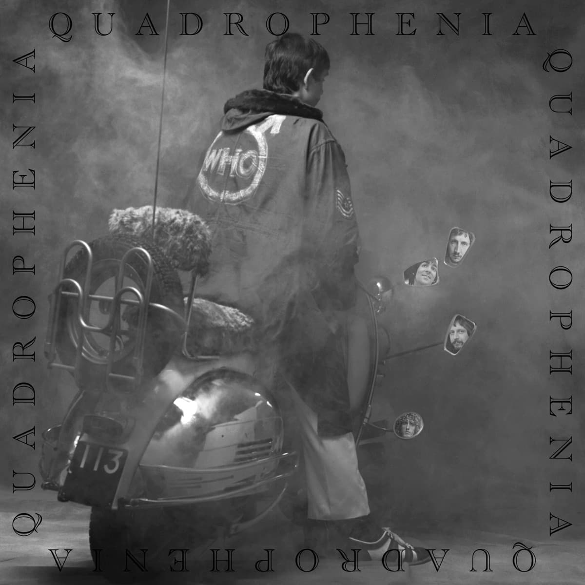
Daltrey wanted the band visible. His idea put Jimmy on a scooter with the four members reflected in its mirrors. Graham Hughes—Daltrey's cousin—photographed and designed the front cover. The Who's own archive now credits it explicitly as Hughes' work from Daltrey's idea, while Russell receives credit for the booklet and back-cover photography.
That distinction matters because Quadrophenia is not merely a cover. The original double LP came with a 44-page book that turned Jimmy's story into something close to a black-and-white photo film. Russell photographed locations and episodes around London and Brighton, building a world of streets, cafés, bedrooms, seaside spaces and mod life around the songs. He later recalled the project as roughly thirty days of relentless work.
The front cover, however, is quieter. Jimmy faces away from us. His parka carries The Who's target-like logo, but his own face is withheld. Instead, the four faces in the scooter mirrors look back. The visual trick explains the title without diagrams: one young man, four reflected identities.
Townshend was never entirely satisfied. He has said he preferred a different emphasis—Jimmy and the mod world rather than making The Who themselves the objects of Jimmy's gaze. He later described the cover as grey and sad even while praising Hughes' photograph and the strength of the idea. That tension is part of what makes the sleeve so interesting. Quadrophenia is a story about wanting to belong and failing to fit neatly inside the identity you have chosen. Even the people making the package disagreed over what its central image should mean.
Russell's rejected composite-face concept and Daltrey's mirror concept were, in a sense, trying to solve the same problem from opposite directions. Russell would fuse four people into one. Daltrey would split one person's view into four. The second idea was easier to read at record-store distance, and it gave the scooter—the great machine of mod mythology—the starring role.
Then the booklet did what a single cover could not. Russell's photographs let Jimmy exist beyond the icon. The physical album became a narrative object: music, lyrics and images experienced together, long before a film adaptation supplied moving pictures.
That is why reducing Quadrophenia to 'the scooter cover' misses half the achievement. Hughes created the unforgettable emblem. Russell created the world behind it.
Inside the design
The front cover of Quadrophenia solves a difficult narrative problem with one machine and four small pieces of glass.
Jimmy, the fictional mod at the center of Pete Townshend's story, sits on his scooter with his back to us. Graham Hughes does not give the unknown young man a heroic face or turn him into a conventional protagonist. Instead, Jimmy becomes a body surrounded by clues. Four rear-view mirrors rise around his shoulders, and in them appear the faces of Roger Daltrey, Pete Townshend, John Entwistle and Keith Moon.
The mirrors make Townshend's four-part personality idea physical without diagramming it. One rider occupies one scooter, but four identities hover around him. The Who are present, yet they are literally reflections rather than the main subject.
That hierarchy matters. A normal band sleeve would use the musicians as the largest and most recognizable visual information. Quadrophenia makes the fan larger than the stars. Jimmy's parka, scooter and posture tell us more about the world of the album than a glamorous group portrait could.
The black-and-white treatment also separates the package from the saturated psychedelic imagery associated with the previous decade. This is a colder Britain of streets, bedrooms, trains and seaside weather.
Opening the LP changes the visual language again. Ethan Russell's 44-page photographic narrative moves away from Hughes' emblematic cover and into something closer to documentary cinema. Russell drew on British social-realist imagery and photographers such as Bill Brandt, building Jimmy's life through rooms, streets, family scenes and journeys.
The two approaches strengthen one another. Hughes gives Quadrophenia an icon. Russell gives the icon a world.
Historical context
Quadrophenia was released in November 1973, nearly a decade after the mod culture that supplied its setting had helped shape The Who's early identity.
Pete Townshend was therefore writing both from memory and from distance. Jimmy's scooters, clothes, records, pills and tribal loyalties belong to the mid-1960s, but the story looks back at them with enough time to see the insecurity beneath the style.
That historical distance shaped the artwork. Graham Hughes' cover does not recreate the bright promotional imagery of The Who's mod-era singles. The black-and-white scooter photograph feels retrospective and slightly severe. Ethan Russell's interior photographs go further, drawing on a tradition of British documentary and social-realist imagery rather than contemporary rock-star glamour.
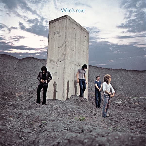
Russell had already photographed The Who extensively, including the famous cover of Who's Next. For Quadrophenia, his assignment expanded dramatically. He later recalled expecting to produce only a handful of pages and returning with something closer to forty. The original LP ultimately contained a 44-page photographic book.
The division of credit is important. The Who's own archive identifies Graham Hughes as responsible for the front-cover photography and design, working from Roger Daltrey's idea. Russell supplied the book photography and original art direction from a concept developed with Townshend.
The album arrived as the LP format itself was becoming increasingly elaborate. Gatefolds, inserts, posters and booklets had given rock artists room to treat packaging as part of the work. Quadrophenia pushed that possibility unusually far: the listener bought not just two records in a sleeve but a substantial visual narrative designed to be handled alongside them.
Legacy & influence
The scooter became one of the defining images of The Who, but Quadrophenia's visual legacy is larger than the front cover.
The 44-page book established a version of Jimmy's world years before the 1979 film gave the character a moving body and a cast of actors. Later audiences often encounter Quadrophenia through the film, yet much of the visual groundwork—the streets, alienation, seaside atmosphere and documentary texture—was already embedded in the original LP.
Ethan Russell's photographic work received a Grammy nomination and became one of the most ambitious examples of narrative photography packaged with a rock record. Graham Hughes' scooter-and-mirrors image meanwhile proved extraordinarily durable because it compresses the story into a symbol that works even without the booklet.
Major reissues have repeatedly treated the original visual material as essential. The Who's vinyl editions have restored the large-format book, while the 2011 Director's Cut expanded the archival presentation into a substantial hardback package. That impulse says something important: the photographs are not bonus decoration that can be discarded once the music is digitized.
The imagery also became entangled with the broader afterlife of mod culture. Scooters, parkas and the Quadrophenia logo became visual shorthand far beyond the album's original audience, particularly after the film helped inspire later mod revivals.
Yet the original sleeve remains more psychologically interesting than a simple celebration of style. Jimmy faces away from us. The band exists only in mirrors. The machine associated with freedom and identity is also the structure surrounding him with competing selves.
That ambiguity is why the cover survives fashion. It looks like mod iconography, but underneath it is a picture of a young person who cannot decide which reflection is his own.