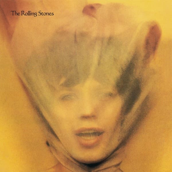


The cover of Goats Head Soup asks you to recognize Mick Jagger by taking his most recognizable asset away. His face is there, almost life-size on the original LP, but David Bailey photographed it through translucent fabric so the features soften into pink, amber and shadow. The mouth is still unmistakably Jagger's; everything around it feels less certain.
Bailey's role was larger than simply making the photograph. Original release credits list him for photography and album or sleeve design, while Ray Lawrence is separately credited as designer. That makes the finished package a more collaborative object than a single-name design credit suggests. Lawrence belongs in the story, but so does Bailey as a designer of the album package as well as the man behind the camera.
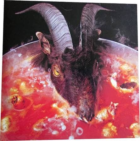
The portrait was not the first direction considered. One early idea literalized the title with an actual goat's head soup image; that material survived inside the package rather than becoming the front cover. Hipgnosis was also asked to develop a sleeve. Aubrey Powell later recalled proposing the Stones as centaurs and satyrs, an elaborate mythological concept that the band initially liked but never used.
What replaced those ideas was drastically simpler. Bailey put Jagger behind gauze and made the obstruction itself the image. Contemporary and later accounts describe Jagger as reluctant about the treatment, while Bailey associated the look with Katharine Hepburn in The African Queen. Whatever the hesitation, the resulting portrait turned concealment into the sleeve's hook: the most famous face in the band is present but deliberately hard to read.
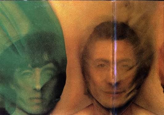
The treatment continues across the package. Mick Taylor, Bill Wyman and Charlie Watts appear behind similar fabric inside the gatefold, with Keith Richards on the back. Rather than giving each member a conventional glamour portrait, the design makes the veil a visual system that binds the package together.
That is the strongest documented story behind the cover. Goats Head Soup did not need to illustrate its title on the front once Bailey and Lawrence had a more unsettling idea: hide the Rolling Stones inside their own portraits. The sleeve's strangeness comes not from an invented symbol but from a simple photographic decision, carried through a package whose original credits give Bailey both photographic and design responsibility.