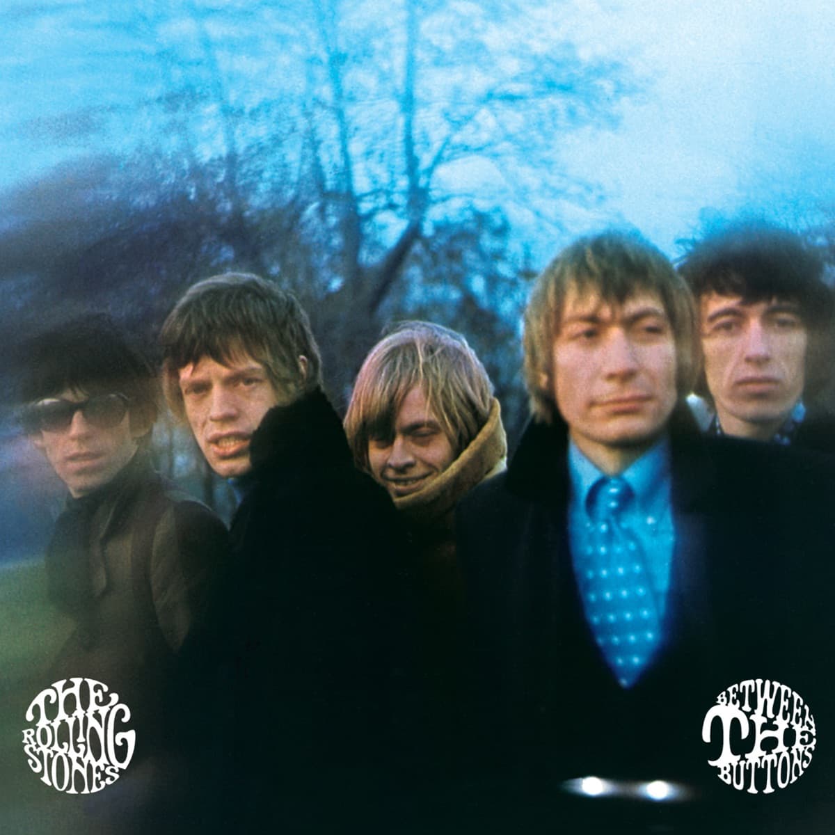
The Rolling Stones had been up all night when Gered Mankowitz decided they looked exactly right.
By late 1966, Mankowitz had spent enough time with the band to know what recording sessions did to them. Dawn left them tired, disheveled and tougher-looking than they did in a controlled studio portrait. For Between the Buttons, he decided to make that state the concept.
After an overnight session, the group headed to Primrose Hill in North London in the early morning. It was November, cold and misty. Mankowitz had only a short window before five exhausted musicians lost patience and went home.
He also brought a homemade filter.
Mankowitz constructed it from glass, black card and Vaseline, using the smeared surface to distort parts of the frame while allowing other areas to resolve more clearly. He later said he wanted to capture the druggy, dissolving atmosphere of the period—the feeling of identities blurring after a night without sleep.
The technique is crucial because the cover's haze was not an accidental bad focus or later psychedelic graphic effect. It was made in camera. The Stones seem to dissolve into the winter air, with faces and bodies alternately emerging from and disappearing into the smear.
Brian Jones is particularly haunting. His collar rises around his face and his pale, withdrawn appearance gives the group portrait an instability that later viewers have found difficult not to read through the tragedy of what came next. But the photograph was made in 1966, not as a retrospective prophecy. Its immediate subject was a band at the edge of exhaustion in a culture whose visual language was changing as quickly as its music.
Mankowitz has called Between the Buttons the first cover for which he felt he was deliberately creating a concept rather than simply making photographs that someone might later choose for a sleeve. His closeness to the Stones and manager Andrew Loog Oldham gave him enough freedom to suggest the dawn session himself.
The title introduced another accident. Charlie Watts was asked to create drawings for the package and was told something about putting the title between the buttons. Watts later recalled misunderstanding the instruction as the actual name of the album. The phrase stuck, adding another layer of casual ambiguity to a sleeve already built around visual uncertainty.
The result is psychedelic without relying on psychedelic illustration. No exploding typography or cosmic collage is necessary. Mankowitz makes five familiar faces unstable with nothing more exotic than weather, exhaustion, glass and Vaseline.
That restraint is why the photograph has aged so well. It captures 1966 not as costume but as atmosphere.
Inside the design
The blur on Between the Buttons is not an accident, and it is not ordinary soft focus.
Gered Mankowitz built a crude filter from black card, glass and Vaseline and held it in front of the lens. The distortion allows faces, hair, coats and winter sky to bleed into one another. Keith Richards can appear to dissolve at the edge; Brian Jones retreats into his collar; the group stops reading as five neatly separated celebrities.
That was the point. Mankowitz had photographed the Stones more straightforwardly before, but by late 1966 he felt close enough to the band and Andrew Loog Oldham to propose a concept rather than simply deliver publicity pictures.
The early hour did part of the work for him. The Stones had recorded through the night, and Mankowitz wanted the exhausted, slightly unreal state that appeared when dawn arrived. Primrose Hill supplied cold air and pale light; the homemade filter translated that physical fatigue into a visual haze.
The composition remains recognizably a group portrait, which is what makes the interference effective. Mankowitz has not abandoned the familiar grammar of five musicians facing a camera. He has made that grammar unstable.
The winter clothing adds another layer. Heavy coats and collars close the figures off rather than presenting the flamboyant bodies associated with later Stones imagery. Faces emerge unevenly from fabric and blur.
Instead of disguising the imperfect conditions, the cover turns them into atmosphere. The band looks as if the night has not quite released them.
That makes the sleeve a transitional image in the most literal sense: five recognizable pop stars photographed at the point where a conventional portrait begins dissolving into something more subjective.
Historical context
Mankowitz made the cover in November 1966 after an all-night Rolling Stones recording session at Olympic Studios.
At about dawn, the group headed to Primrose Hill in North London. Mankowitz had been working closely with the Stones since 1965 and had enough trust by then to push beyond conventional portraiture. He later described wanting to capture the druggy, ethereal atmosphere of the period and the peculiar appearance the band had after recording all night.
The shoot lasted only a short time. It was cold, everyone was tired, and Brian Jones was not especially cooperative. Those circumstances became assets rather than defects.
The album appeared in early 1967, just as British pop imagery was becoming dramatically more experimental. Within months, psychedelic sleeve design would be everywhere. Between the Buttons sits in that transition: still recognizably a band photograph, but deliberately damaged until portraiture begins turning into atmosphere.
The Stones themselves were also in transition. Their records were moving beyond the blues and R&B framework that had defined their early reputation, with increasingly elaborate arrangements and a broader palette of instruments entering the studio.
Mankowitz's hazy image does not attempt to catalogue those musical changes, but it makes the band look less fixed at precisely the moment their records were becoming less predictable.
That is why the date matters. A similar photograph made two years later would simply belong to an established psychedelic visual vocabulary. Made in late 1966, it catches that vocabulary while it is still forming.
Legacy & influence
Mankowitz went on to photograph some of rock's most recognizable figures, but he continues to single out Between the Buttons as a decisive step in his own development.
The cover survives because its technique is inseparable from its mood. A modern designer could reproduce blur in seconds, but the homemade glass-and-Vaseline filter carries the physical improvisation of the period. The image feels discovered in-camera rather than applied afterward.
Outtakes from the Primrose Hill session have since become collectible photographs in their own right, revealing how much variation Mankowitz found inside the same short, cold morning.
The sleeve also preserves a version of the Stones that was about to disappear. By the end of the decade the band's lineup, sound and visual mythology would all change. Brian Jones would be gone, and the group would acquire a harder, more overtly iconic visual identity.
Between the Buttons leaves the five of them suspended together in fog—recognizable, unstable and already beginning to dissolve.
For Mankowitz, the session also marks the point at which his relationship with musicians could support a more authored photographic idea. That matters in the broader history of album covers: rock photographers were increasingly becoming conceptual collaborators rather than technicians supplying usable publicity shots.
The physical method has become part of the photograph's mythology, but it should not obscure the underlying achievement. Vaseline is only a tool. What lasts is Mankowitz's recognition that exhaustion, weather and imperfect visibility could describe the Stones more interestingly than another perfectly sharp portrait.