

The cover of American Pie began before the album itself had been recorded. In Don McLean's account of the shoot, Mediarts sent him to Los Angeles in early 1971 to make cover photographs with George S. Whiteman, a fashion and portrait photographer. The Record Plant sessions that produced the album would come later, in May and June, in New York.
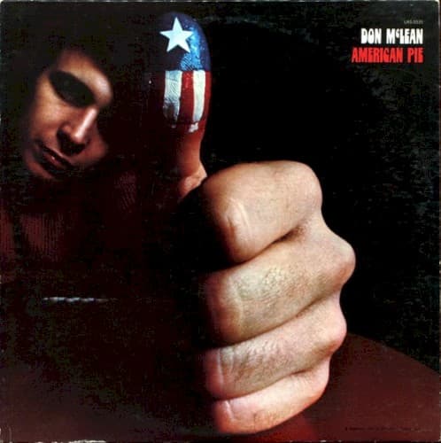
McLean remembered the introduction vividly. After the two men met, Whiteman proposed painting McLean's thumb. That simple idea became the front cover's entire visual engine. A clenched hand fills the foreground, the thumb rising from it with a white star and red-and-white stripes painted directly on the skin. McLean's face sits behind the hand, pushed toward the left edge and partly lost in shadow.
The release credits make Whiteman's role unusually clear: he is credited for photography and design. That matters because the sleeve is sometimes discussed as though the flag-painted thumb were merely a promotional photograph that someone else turned into a cover. The surviving credit record instead assigns Whiteman both the image-making and the overall design role.
Most of the square is visually quiet. The hand and face emerge against darkness, while the artist name and album title are kept small in the upper-right corner. The title appears in red, picking up the red already present in the painted flag and the surface beneath McLean's wrist. The typography identifies the record without competing with the gesture.
The gesture invites interpretation, but the documented story does not require a single fixed meaning. A painted American flag on an upright thumb can read as patriotic, ironic, celebratory or confrontational depending on what the viewer brings to it. The clenched hand below the thumb complicates the familiar thumbs-up shape, and McLean's shadowed expression adds another note of uncertainty. Those are visual readings of the photograph, not statements of Whiteman's documented intent.
The chronology gives the image another useful dimension. McLean had not yet gone into the Record Plant to record the album when he traveled west for the shoot. The cover therefore was not a visual response to a finished master or a photograph made during recording. It was one of the elements being assembled while the project itself was still taking shape.
The wider package carried more of McLean's personal mythology. His official site confirms that the original album included his poem So Long Hopalong Cassidy on the inside cover, a tribute to William Boyd's cowboy character. MusicBrainz also records the release-group dedication to Buddy Holly. The package therefore placed Whiteman's stark flag-thumb photograph on the outside while reserving a more explicit piece of McLean's cultural memory for the interior.
That division helps explain why the front cover remains so effective. It does not attempt to diagram an eight-and-a-half-minute song or explain its references. Instead it reduces the album to one strange, instantly readable visual device: an American symbol painted onto the artist's own body, photographed close enough to overpower the man behind it.