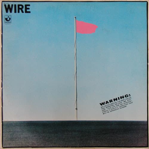

There is almost nothing on the front of Pink Flag. A flagpole rises against a pale, largely empty sky. Near its top is a bright patch of pink, tiny compared with the surrounding space. The title sounds like a declaration, yet the image makes that declaration with an object so small it almost disappears. In a year when punk sleeves were full of torn lettering, confrontation and graphic noise, Wire chose restraint.
The record arrived in late 1977, when the first explosion of British punk had already begun to develop its own visual conventions. A new band could announce itself with a snarling photograph, a ransom-note collage or a crude drawing. Wire's debut sleeve offered no faces at all. Instead it presented a spare composition that looked closer to an art-school proposition than to the expected packaging for an aggressive guitar group. That was not a mistake. Wire were interested in stripping things down until the smallest gesture carried the greatest weight.
The original sleeve credits make the authorship unusually clear. Guitarist Bruce Gilbert and bassist Graham Lewis were responsible for the sleeve concept; Annette Green took the front-cover photograph; David Dragon was credited with art direction. Those distinctions matter because the image was not simply a photograph found by a record company. The band helped determine the idea, a photographer made the underlying picture, and an art director shaped the finished package.
The front image uses the simple fact of a flagpole to create an almost absurd visual joke. The expected banner of identity, affiliation or nation is reduced to a sliver of color. The title Pink Flag promises an emblem, but the emblem barely asserts itself. There is plenty of sky and very little flag. The viewer has to search the picture to find the thing it names.
That economy is an apt introduction to the music. Wire recorded the album at Advision Studios in London with producer Mike Thorne and engineer Paul Hardiman. The band could be loud and sharp, but they were just as interested in what could be removed. Twenty-one songs fit into roughly thirty-six minutes. Some are barely longer than a thought. 'Field Day for the Sundays' is over almost as soon as it begins; 'Three Girl Rhumba' takes a repetitive guitar figure and turns its small shifts into an entire world; '12 X U' delivers a compressed burst of energy without needing the length of a conventional rock song.
The cover does not illustrate those tracks. It behaves like them. A minimal set of elements is arranged so that the empty space becomes as important as the thing placed inside it. The pole, the small flag and the sky form a visual equivalent of the band's clipped musical phrases. Nothing seems to be present merely to fill a gap.
Wire's members brought different sensibilities to this method. Gilbert had studied at Watford College of Art, while Lewis's background included art school and performance. That context helps explain the cover's conceptual character without requiring the image to be read as an elaborate coded message. Its wit is plain enough: the grand gesture of raising a flag has been reduced to an almost comically small flag.
There is also a crucial difference between this sleeve and the imagery of punk rebellion that became familiar through newspapers and fashion magazines. The band is absent. No one is posing with a guitar or attempting to demonstrate authenticity. A person encountering the album in a shop would have to accept the artwork as an introduction before knowing what any of the musicians looked like. The cover withholds the easy reassurance of a portrait.
The recording itself similarly resisted reassurance. Mike Thorne's production kept the music precise without smoothing away its abrasiveness. Robert Gotobed's drumming could sound both mechanical and urgent, Colin Newman's vocals could turn suddenly from detached to insistent, and Gilbert's guitar often worked as a texture or interruption rather than a vehicle for traditional solos. Lewis's bass helped hold the short pieces together. The songs are compact, but they are not interchangeable.
One reason Pink Flag became so influential is that it showed how punk's freedom could lead somewhere other than a louder version of rock. The record kept the directness of punk while introducing structural ideas that later listeners would associate with post-punk. Its cover makes the same move visually. It takes the declarative energy of a flag and removes nearly all the spectacle usually attached to it.
The photograph also belongs to the material history of the LP. The original UK Harvest pressing carried the sleeve concept and photography credits, and its printed inner sleeve contained the lyrics. That physical package matters. A large square cover with so much open sky is a different experience from a tiny streaming thumbnail, where the flag can become nearly invisible. The original artwork asks the viewer to stand back, look again and notice how little it needs.
Reissues have introduced their own packaging and art-direction credits. Those should not be confused with the 1977 sleeve. The original photograph belongs to Annette Green, the concept to Gilbert and Lewis, and the art direction to David Dragon. Preserving that division of labor reveals a small collaboration whose result has often been discussed only in terms of the band's larger artistic identity.
The album's name could have become a visual cliché: a big banner waving dramatically, announcing the arrival of an important new group. Wire did almost the opposite. The flag is there, but it hardly occupies the image. The boldest choice was to leave almost everything else out.