The original British sleeve of This Year's Model looks wrong. Elvis Costello's name loses its opening letter. The title becomes 'His Year's Model.' A printer's color-control strip intrudes along the opposite edge. None of it was accidental.\n\nDesigner Barney Bubbles deliberately made the package resemble a manufacturing mistake. Costello later explained the logic plainly: if somebody in a record shop wondered why the sleeve had been printed off-register, they would pause in front of it for a little longer. In a rack crowded with polished album covers, apparent failure became an attention device.\n\nThe photograph underneath the trick was by Chris Gabrin. Costello appears behind a camera on a tripod, dressed in the severe visual uniform already becoming part of his public identity. The setup reverses the usual relationship between performer and viewer. Costello is the person being photographed for an album cover, but he is also staring through a camera of his own.\n\nBubbles then disrupted the photograph's authority. Rather than center it cleanly and add conventional typography, he shifted the printed image so part of the intended front effectively wraps away. The visible color bar makes the sleeve look like something that should have been rejected during production. Design Week later described the effect as a parody of the elaborate, highly finished sleeve culture associated with designers such as Hipgnosis.\n\nThe joke depends on precision. 'Lvis Costello' remains recognizable as Elvis Costello; 'His Year's Model' still sounds enough like a phrase to make the viewer notice what is missing. Bubbles did not create random damage. He engineered a controlled error that remained legible while exposing the normally invisible machinery of printing.\n\nDifferent territories complicated the story. The American and Swedish editions used different photographs and did not reproduce the British sleeve's deliberately misregistered construction in exactly the same way. Later reissues also tended to straighten the design. That means the famous 'mistake' is specifically part of the original UK package rather than a universal feature of every copy bearing the album title.\n\nBubbles carried the mischievous approach beyond the front. Early pressings included cryptic promotional details in the runout area and a free single, extending the sense that the package contained things for attentive listeners to discover.\n\nThe result fits Costello's early persona almost perfectly: confrontational, clever, impatient with polish and aware of the machinery selling rebellion back to an audience. Bubbles made a professional sleeve by pretending professionalism had failed.
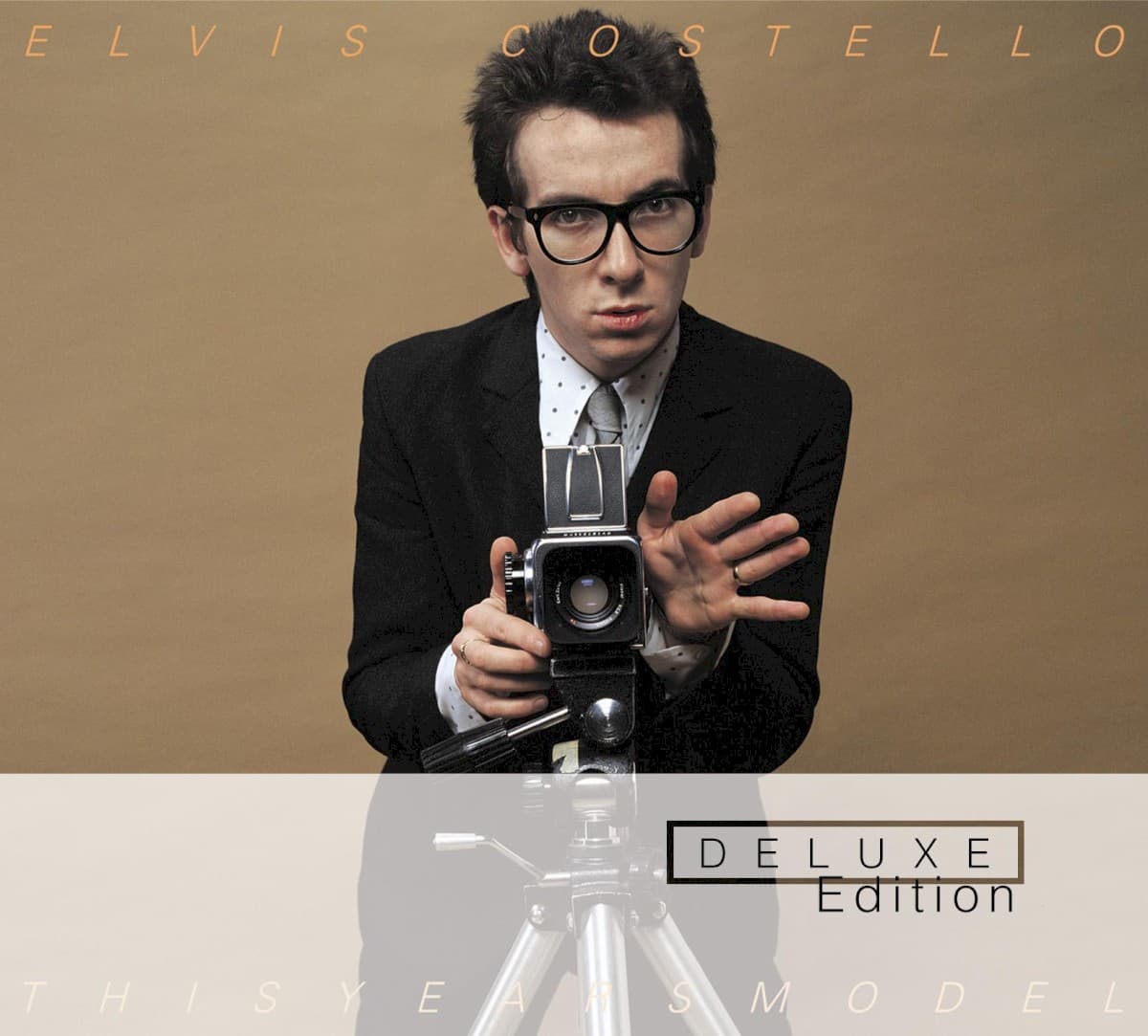
Design Barney Bubbles · Photo Chris Gabrin · Radar Records · © respective owner · fair use
This Year's Model
Barney Bubbles made This Year's Model look misprinted on purpose. Chris Gabrin's confrontational portrait of Elvis Costello was shifted off the sleeve, cropping letters from the artist and title while exposing a printer's color bar—an intentional production 'error' designed to make record-store shoppers stop and look twice.
 Read nextLook Sharp!Brian Griffin photographed Joe Jackson's new white shoes almost as an afterthought during a day of portraits. A shaft of sunlight on London's South Bank turned the five-minute shot into Look Sharp!'s famous cover—and Jackson reportedly hated that his face had disappeared from his own debut sleeve.
Quick Facts
- Album
- This Year's Model
- Artist
- Elvis Costello & The Attractions
- Released
- 1978
- On the cover
- Chris Gabrin's photograph of Elvis Costello behind a camera, deliberately shifted off-register by designer Barney Bubbles so the left edge is cropped and a printer's color bar remains visible on the right.
- Label
- Radar Records
- Design
- Barney Bubbles
- Photography
- Chris Gabrin
- Genre
- Pop
- Decade
- 1970s
Inside the design
Visual analysis
The photograph is already about looking. Costello stands behind a camera while another camera photographs him, turning observation into the subject of the image. Bubbles' layout adds another layer: the viewer becomes conscious not only of the photograph but of the industrial process that reproduces it.\n\nThe printer's color bar is normally evidence meant to disappear before a finished object reaches a customer. Leaving it visible collapses the distinction between artwork and production artifact. Cropping the first letters of the artist and title makes that disruption impossible to miss.\n\nWhat looks careless is therefore tightly controlled. The sleeve succeeds because it is wrong in exactly the right places.
Why it matters
Why this cover matters
This Year's Model turns a printing error into marketing without disguising the manipulation. Costello explicitly said the off-register appearance was intended to make shoppers pause. Barney Bubbles understood that a record cover did not need to look more beautiful than its competitors; it could look more suspicious.\n\nThat makes the sleeve an important bridge between punk's distrust of polish and sophisticated graphic design. Its apparent mistake required enough design intelligence to know exactly which conventions could be broken while keeping the package readable and memorable.
Historical context
Historical context
Released in 1978, This Year's Model was Costello's second album and his first credited with The Attractions. Its visual language emerged from the British punk/new-wave environment, where designers increasingly challenged the polished conventions of mainstream record packaging.
Legacy & influence
Legacy and influence
The intentionally misregistered UK sleeve became one of Barney Bubbles' best-known designs and a frequently cited example of purposeful graphic 'error.' Later aligned editions inadvertently demonstrate the strength of the original idea: correcting the mistake removes much of what made the package distinctive.
About the This Year's Model cover
What is on the cover of This Year's Model by Elvis Costello & The Attractions?
Chris Gabrin's photograph of Elvis Costello behind a camera, deliberately shifted off-register by designer Barney Bubbles so the left edge is cropped and a printer's color bar remains visible on the right.
Who designed the This Year's Model album cover?
The This Year's Model album cover was designed by Barney Bubbles for Elvis Costello & The Attractions's 1978 release.
Who photographed the This Year's Model album cover?
The cover photograph for Elvis Costello & The Attractions's This Year's Model was taken by Chris Gabrin.
When was This Year's Model by Elvis Costello & The Attractions released?
This Year's Model by Elvis Costello & The Attractions was released in 1978 on Radar Records.
What is the story behind the This Year's Model album cover?
Barney Bubbles made This Year's Model look misprinted on purpose. Chris Gabrin's confrontational portrait of Elvis Costello was shifted off the sleeve, cropping letters from the artist and title while exposing a printer's color bar—an intentional production 'error' designed to make record-store shoppers stop and look twice.
Shop this cover
Own This Year's Model on vinyl & more
As an Amazon Associate and eBay Partner, Behind the Covers earns from qualifying purchases — at no extra cost to you. See our affiliate disclosure.
Color palette
Dominant colors on this cover
#9e8465
#1b1a19
#e4dcd4
#7e664c
#bebab8
The web behind this cover
Click any node to open the full explorer
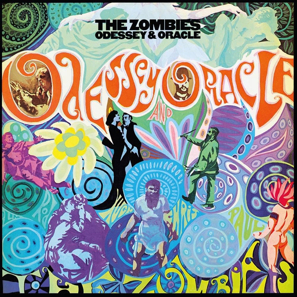
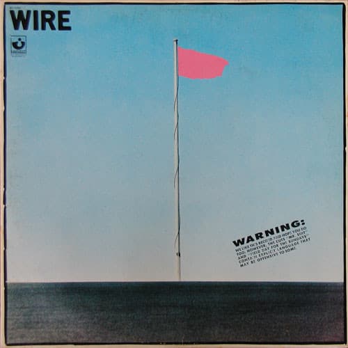
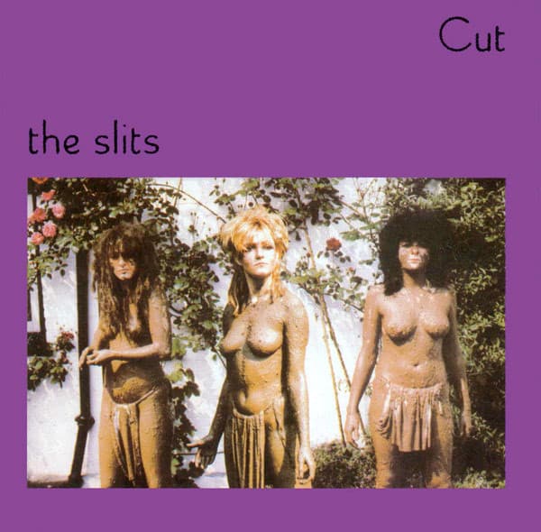
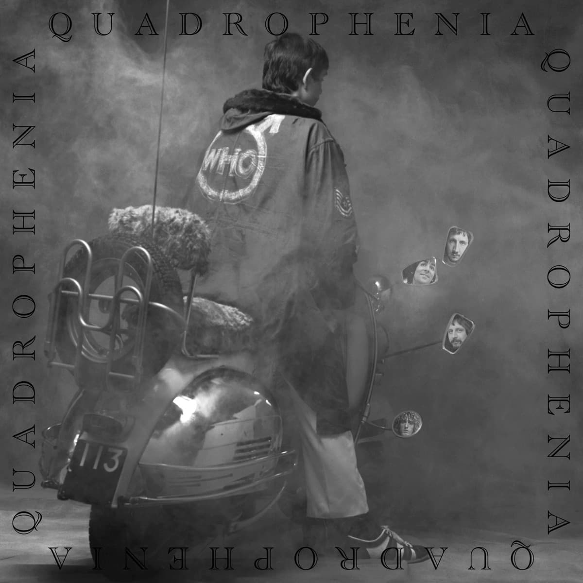



Keep exploring
Connections across Behind the Covers
Up next
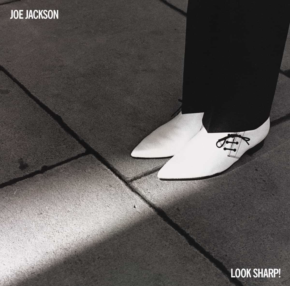
Look Sharp!
Joe Jackson · 1979 · Michael Ross
Brian Griffin photographed Joe Jackson's new white shoes almost as an afterthought during a day of portraits. A shaft of sunlight on London's South Bank turned the five-minute shot into Look Sharp!'s famous cover—and Jackson reportedly hated that his face had disappeared from his own debut sleeve.
Read this story →Read more in our guides
- A History of Album Cover ArtFrom plain brown sleeves to a billion-dollar design medium: how the record cover became a canvas.
- Psychedelic Album Covers: Color, Distortion, and the 1960sMelting type, impossible color, and collage: how the 1960s counterculture redrew the record sleeve.
- The Art of the Gatefold: Album Packaging as DesignFold it open and the record becomes an object: how packaging, not just the front cover, shaped album art.
Want to explore more?
Never miss a new cover story
Get the Behind the Covers app and turn on notifications — we publish new album art deep dives every day.