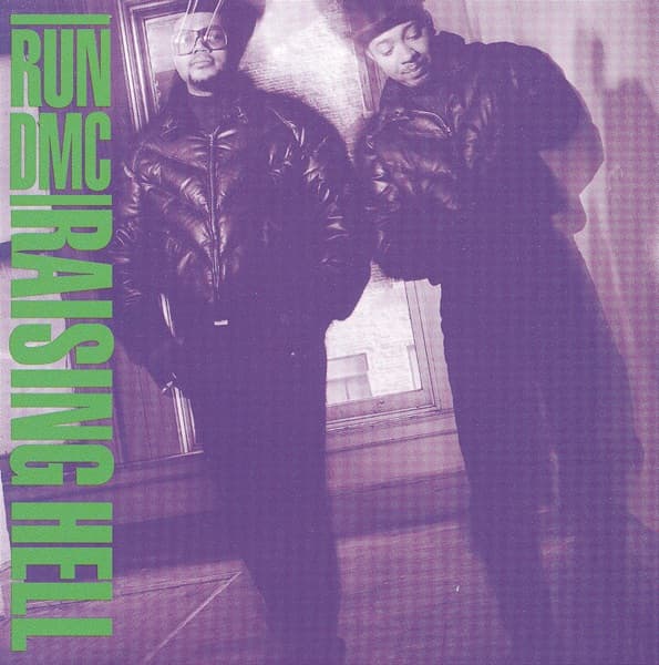
The governing decision is the Dutch angle. The frame is tipped so the floorboards run diagonally beneath the two figures and a tall window glows behind them, and that single tilt does the heavy lifting: it destabilizes what would otherwise be a flat wall-and-portrait setup, pulling the eye off the horizontal and giving the whole scene a forward lean, as though the pair are sliding toward you. A straight-on snapshot of a band against a wall would have been forgettable. Held at a slant, the same information becomes kinetic.
Color is the second shock, and the most total. The image is not black-and-white and not full color but a tinted duotone, everything collapsed into one violet register. Skin, leather, and floorboards all read as shades of the same purple, which flattens the individuals into a single tonal field and makes the picture feel designed rather than merely taken. Against that unified wash, the type has nowhere to hide. RUN DMC stacks in tight capitals at the top left; RAISING HELL runs vertically down the spine of the cover, set against the group's horizontal name and framed with parallel lines. The lettering is blunt, no-nonsense, and glaringly green. Perr traced this collision of vertical against horizontal, hard rules and acid color, to what she called her Russian Constructivist phase, and the debt shows in the poster-like severity: type treated as structure, not decoration, arranged like signage down the edge of a storefront.
The focal path moves accordingly. The green type snags first because it is the only element that breaks the purple monotone, then the eye slides inward along the tilted floor to the two figures, then up past their leather to the glowing window behind. That window is the picture's light source and its depth: through the mullioned glass you can faintly make out the side of a building outside, a small piece of the world that keeps the frame from reading as pure studio abstraction.
The figures themselves are read through posture rather than expression. One wears thick-framed glasses and a soft hat and faces out; the other tucks his chin, eyes lowered, brim pulled down. Both are zipped and buttoned into thick black leather, one a quilted bomber closed to the throat, the other a longer coat that pools into shadow at the bottom of the frame. Hands are buried, shoulders squared against the wall and the windowpane. They occupy the space instead of performing in it, and the negative space around them, the bare wall and the empty glowing pane, refuses to supply any set dressing or story.
That emptiness is the meaning. There is no scene, no prop, no costume beyond what the group actually wore, so the absence of a concept becomes the statement. The tilt, the saturated duotone, and the slab of green type are the only rhetoric, and they are enough to turn two men standing in a room into an image that reads as confident and loud. The cover trusts the people in front of the lens to carry it, and the design simply amplifies them. That is why it works: everything decorative has been stripped out, and what remains is presence, tilted and recolored until it feels like something you cannot look past.