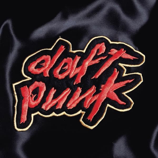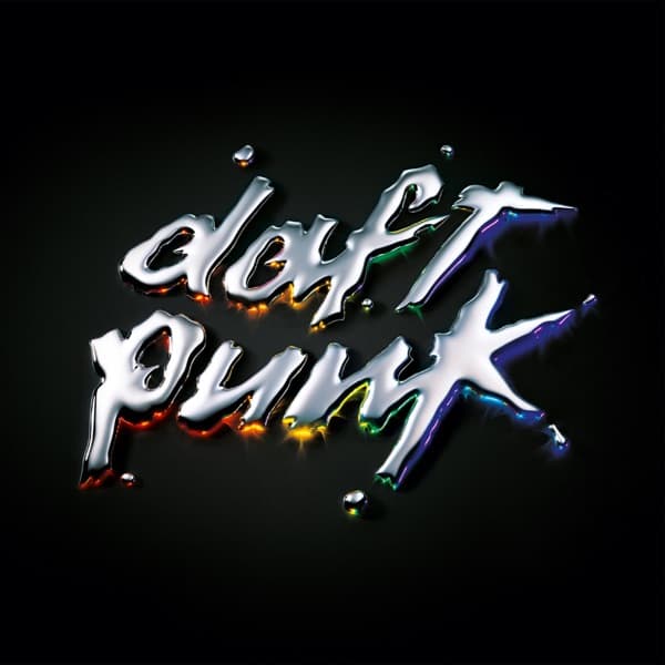

The eye lands on a single glowing word before it reads anything at all. Against a field of near-total black, the name Daft Punk hangs in molten chrome, each letter shaped as if poured rather than drawn, curling and dripping with the wet gleam of mercury. Look closer and the metal isn't silver at all: pinpricks of light burst off the edges in tiny four-pointed stars, and along the lower curves of the letters the reflections bleed into a full rainbow, orange and gold pooling under the 'p' and 'u', cool blues and greens flaring off the tail of the final 'k'. There is no album title on the front, no photograph, no faces. The design does everything with light bouncing off imaginary liquid, a purely typographic cover that treats the group's name as a sculptural object.
That restraint is a kind of misdirection, because Discovery, released on 12 March 2001 through Virgin Records, is one of the least restrained records the duo ever made. Where the cover holds two calm words in a void, the music inside spills over: this was the album where Daft Punk went maximalist, folding '80s-tinged pop, funk, and arena-rock swagger into a shinier, brighter version of their house sound. The chrome lettering, glossy and overloaded with reflected color, turns out to be a fair visual translation of that shift, all surface, all shine, all spectrum.
The secrecy of the sleeve, no human present, was the whole point of the era. For Discovery, Daft Punk adopted robot personas. Thomas Bangalter's look was modeled on the robot Gort from the 1951 science-fiction film The Day the Earth Stood Still, while Guy-Manuel de Homem-Christo's helmet carried a vertical LED display. They explained the transformation with a straight-faced joke, a supposedly lost 2001 interview in which they claimed they'd had 'a little accident with the machines on the 9th of September '99,' and that was why they now looked like robots. The cover keeps that mythology intact by refusing to show a single face: only the name, gleaming like polished machine parts.
That liquid-metal wordmark also doubles as a thesis. The reflected rainbow trapped in the chrome reads less like decoration and more like a promise of everything the album tries to contain, every genre and decade catching a different color. The stars sparking off the letters suggest something cosmic, and that instinct isn't accidental. For the album's visual concept, Daft Punk merged science fiction with the entertainment industry, drawing on their childhood love of Japanese anime.
That love became a full film. The duo collaborated with Leiji Matsumoto to produce Interstella 5555: The 5tory of the 5ecret 5tar 5ystem, an animated feature that used Discovery as its complete soundtrack, turning the album's every track into a chapter of one continuous space opera. The blank, iconic simplicity of the front sleeve leaves room for that story to exist elsewhere, on screen rather than on cardboard.
The anime tie eventually reached the packaging too. A later limited-edition Japanese reissue swapped in alternate gatefold artwork made to promote the Interstella 5555 film, deepening the group's collaboration with Matsumoto and Toei Animation. It's a telling contrast: the original international cover stays abstract and wordless, all cold chrome and stars, while the reissue opens up into hand-drawn characters and narrative. Two ways of selling the same music, one hiding the story, one showing it.
And the shine on that cover hides an unpaid debt. The album's lead single, 'One More Time,' is built on a sample of the 1979 disco track 'More Spell on You' by Eddie Johns. Daft Punk pay royalties on it to the publisher holding the rights, and yet Johns himself was never located. As of 2021 he was owed an estimated six-to-seven-figure sum, a fortune generated by one of the most joyful pop records of the century, waiting for a man nobody could find. The gleaming, rainbow-soaked lettering looks like pure celebration; underneath it sits a story about disco's uncredited ghosts.
Everything about the design signals a break from the past, and that was deliberate. 'We didn't want in any way to do what we did on the first album,' Bangalter told Big Shot in 2001, and the sleeve enforces that intention through pure typography. There is no house-music iconography, no club imagery, no repeat of an earlier look. Just the name, remade in a new material, catching new light.
What's remarkable is how much weight the cover carries with so little. The composition is almost entirely empty: the two words sit slightly off-center, tilted, the black around them swallowing most of the frame. That emptiness makes the chrome feel suspended, weightless, like something floating in the star system the anime would later imagine. The small burst-stars scattered across the letters are the only movement, and they read like flashbulbs, tiny reminders of the entertainment-industry glamour the whole project set out to fuse with science fiction.
Seen now, the sleeve works as a self-portrait of two musicians who chose to disappear behind machines and mythology. No faces, no helmets, no film stills, only a name rendered as gleaming metal, radiating a rainbow it borrowed from the light around it. For an album that reached back into disco, funk, and '80s pop and forward into robots and anime, a wordmark that looks both antique-shiny and futuristic-cold is exactly the right kind of trick.