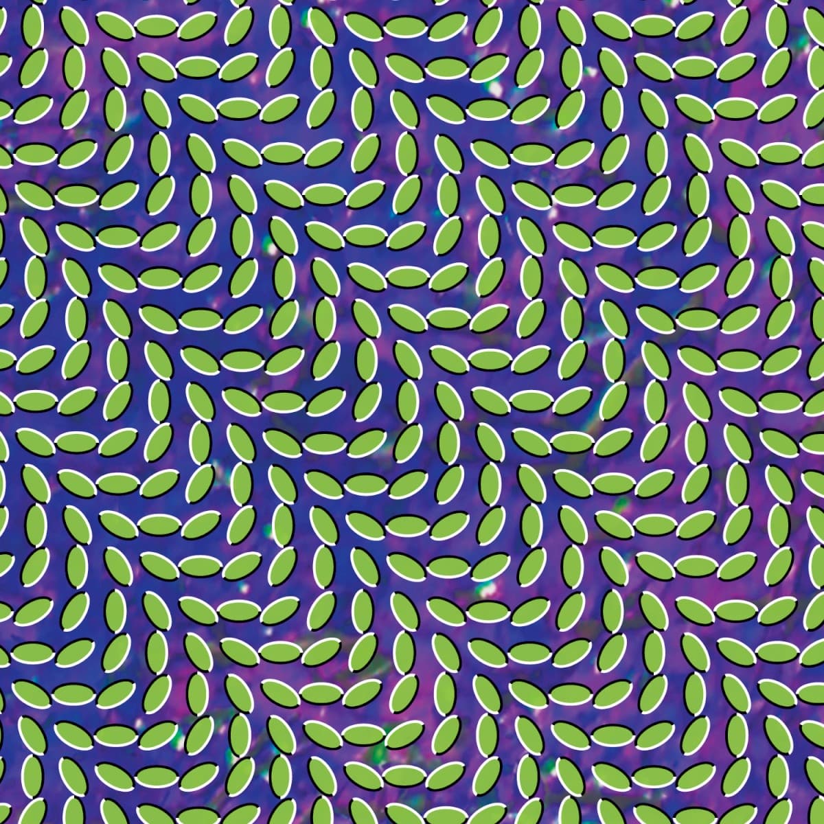

Merriweather Post Pavilion starts moving before the record does. The cover is printed and completely static, yet its repeated black-and-white forms seem to ripple, pulse and slide when the eye travels across them. It is one of those rare sleeves whose central effect is not an object pictured on the front but something that happens inside the viewer's perception.
The production credit is unusually clear. Rob Carmichael's studio SEEN identifies the project as LP/CD art direction and design and states that the optical cover pattern is based on the work of Japanese psychologist Akiyoshi Kitaoka. The original release packaging likewise credits the cover image pattern to Kitaoka and the design and layout to Carmichael/SEEN. Those are distinct roles worth preserving: Kitaoka's visual research supplied the underlying perceptual language; Carmichael turned that language into the package for Animal Collective's album.
That distinction matters because the image is often described simply as an optical-illusion cover, as though the band or designer invented the phenomenon from scratch. Merriweather Post Pavilion takes Kitaoka's established perceptual language and puts it into a sleeve whose geometry survives reproduction at very different scales. On a vinyl jacket the pattern can occupy much of the viewer's field of vision. On a streaming thumbnail it remains strange enough to interrupt a scroll.
The design is unusually well matched to the music without literally illustrating a song or lyric. Animal Collective's 2009 album is dense with loops, repeated vocal phrases, layered electronics and sounds that seem to change depending on where the listener focuses. The cover behaves similarly. Repetition creates instability. Looking harder does not make the image settle down; shifting attention can make another part of it seem to move instead.
There is no band portrait, landscape or picture of the Maryland concert venue that gives the album its title. The visual package chooses perception itself as the subject rather than turning the title into a literal scene.
The black-and-white palette is not merely austere decoration. High contrast, repeated curves and tightly controlled spacing create the conditions for the illusion. The eye tries to stabilize the surface and instead becomes part of the mechanism.
The wider package extended the visual world beyond the front. Original-release credits identify David Doubilet's underwater photograph Devil's Eye Spring as an interior image, adding another kind of perceptual environment inside the gatefold. But the front remains the decisive gesture: a printed object that appears unwilling to stay still.
The cover's durability is easy to understand. Many late-2000s sleeves were already being encountered through small digital images, where fine photographic detail could disappear. Merriweather Post Pavilion works almost perversely well in that environment. Its pattern is legible as texture from far away and becomes more disorienting as the viewer gives it attention. It is not just recognizable artwork; it is a small visual event.