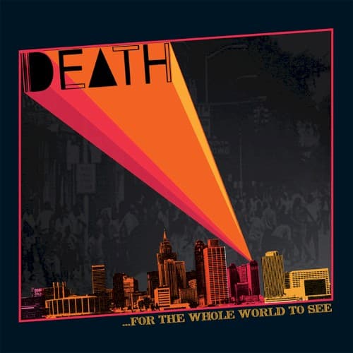
The frame is set by a deep navy border, a hard edge that boxes the image in and pushes all the drama inward. Against that darkness, the top-left corner is given entirely to the word DEATH, set in tall, geometric letters, the A built as a bare triangle. The typography does two jobs at once: it is confrontational and blunt, the way the band's own name was blunt enough to get them dropped, and it is clean and modern, a piece of contemporary design laid over decades-old music.
From just behind that logo, a beam of light fans open. It is rendered as concentric bands of colour, moving from a hot pink at the outer edge through red and orange to a bright core, and it widens from a single point down and to the left across the whole lower half of the cover. This is the compositional engine of the picture. The eye enters on the logo, catches the vertex of the beam, and slides down its length, so the design controls exactly where you look and in what order. The narrowing shape works like a spotlight or a signal flare, an act of exposure that literally acts out the album's title.
Where the light lands, a city skyline sits in silhouette along the bottom, its towers picked out in the same pink and orange glow. The skyline grounds the image in place, honouring the band's Detroit roots, and it turns the beam into something aimed at a specific city rather than an abstraction. Behind and above the skyline, the background holds a faded, near-monochrome street scene, a crowd and buildings drained of colour so that they recede into memory. The contrast is the whole point: the past is held in grey, half-erased, while the present announcement arrives in saturated colour. The negative space of the dark upper field lets the beam read as the only source of light in the picture, a single illumination cutting through a forgotten scene.
The title, ...For the Whole World to See, is set small in yellow in the lower right, deliberately understated against the shout of the logo. Its placement at the end of the beam's travel means you read it last, as a caption to everything the light has just uncovered. The ellipsis before it lets the phrase hang, as if a sentence long interrupted is finally being finished.
Read as a whole, the cover stages a resurrection. A raw, unpolished aesthetic that matches the garage-rock energy of the music is married to a strong graphic idea: light thrown across a darkened city so that something buried can, at last, be seen. The design bridges the album's 1970s origins and its 2009 rediscovery, making the object feel less like a reissue than like an archaeological find hauled up into daylight. The image works because its form and its title say the same thing at the same time.