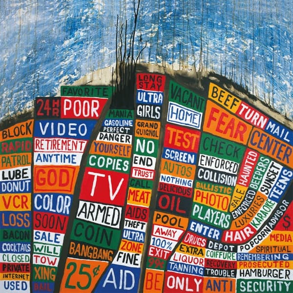
The geography is genuinely legible if you let your eye follow it. A dark diagonal ridge runs across the upper third, painted in loose, dripping brushstrokes of blue and white with thin black lines bleeding down from it like rain or like the edge of a coastline dissolving. Below that ridge the land begins, and the land is made entirely of text. Curving boulevards of colour sweep from the lower left toward the right, the tiles bending along them so you can almost feel the streets. It is a city seen from above, its blocks and avenues traced not in ink lines but in the collision of a thousand commercial words.
The palette works as a discipline, not an accident, and you can count it: black, white and five colours, reds, oranges, greens, blues and yellows, each word boxed in its own solid field. The restraint is what keeps the chaos readable. Set a green word beside a red one beside a blue one and the eye keeps moving, never resting, exactly the way a bombardment of advertising never lets you rest.
The focal path is engineered. The eye lands first on the big red TV block dead centre, blazing white on red, flanked by COIN and BANGBANG and a defiant 25 cents. From there it gets pulled outward: to FEAR sitting huge in orange near the top right, next to TURN and MAIL and CENTER; to POOR; to VIDEO; to GOD glowing yellow-green above COLOR and SOON. Once it starts wandering it cannot stop.
And the language is aggressive. That menace soaks into every corner, but it shares the surface with smaller human desperations: RETIREMENT, LOSS, BAIL, AIDS, DRUGS, RECOVERY, TROUBLE, LIQUOR, TANNING. The typography does the argument. By boxing every word in its own tile and lettering it by hand, the image flattens fear and commerce and prayer into a single visual grammar, so that a plea and a price tag look identical and equally shrill.
The whole thing reads on two scales at once, which is why it holds. From a distance it is cartography, an aerial view of streets and a shoreline. Up close it dissolves into signage, the isolated words of a place selling and warning and pleading simultaneously. The meaning lives in that oscillation: a portrait of a society that has converted every anxiety into a slogan and every slogan into a product, until the map of a city and the noise of its advertising become the same object. For a picture assembled from words like LUBE, DONUT, HAMBURGER and HAIR, it is a remarkably exact image of manufactured dread, the sound of consumer language turned into a warning it can no longer hear.