Transatlanticism does not look empty. It looks caught.
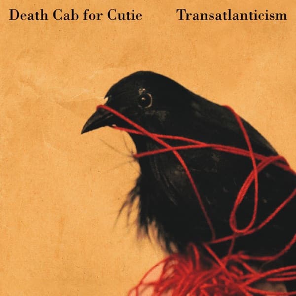
A black bird occupies the lower-right half of the sleeve. Bright red string crosses its beak, wraps around its body and drops into loose tangles below. Behind it is a warm, weathered yellow-beige field. Death Cab for Cutie's name sits quietly at the upper left and Transatlanticism at the upper right in small black serif type.
That image is the opposite of the blank white, typography-only cover that had previously been described on this page. The actual artwork was created by Seattle artist Adde Russell, whom Death Cab for Cutie's official release credits name for both the original artwork and layout.
Russell came into the project through the Seattle and Barsuk Records circle around the band. She produced a large body of exploratory work rather than beginning with one fixed final design. The image that endured started with a physical object: Russell found a white Styrofoam bird in a hobby shop and worked with red string around it. Accounts of the project consistently note that bassist Nick Harmer was especially drawn to the bird-and-string motif, encouraging its development into the visual center of the album package.
That origin story matters because it gives the cover a more interesting history than a retrospective theory about minimalism. Russell began with an inexpensive prop and a simple material gesture, then turned those elements into an image whose tension can be understood immediately. The bird forms one dense dark mass. The red string cuts across it in sharp lines. The open ochre field gives the entanglement room to register without crowding it.
The image naturally invites metaphor. Transatlanticism is an album full of distance, longing and difficult connection, so a bird caught in string can feel emotionally adjacent to those themes. But that is interpretation, not a license to assign a fixed symbolic meaning to every strand. Unless Russell or the band explicitly identifies a particular meaning, the strongest account stays close to what is documented: a found hobby-shop bird, red string, a long exploratory art process and an image the band chose to carry the record.
The typography plays a supporting role rather than becoming the cover's subject. Small black serif lettering sits across the top edge while the bird and string dominate the square. There is negative space, but the negative space serves the figurative artwork; it is not an image-free anti-design statement.
That distinction also removes the need for claims that the sleeve was designed with later digital-thumbnail behavior in mind. The cover works at small scale because its visual structure is strong: black bird, red line, warm field, small dark type. That effectiveness can be observed today without retroactively inventing a streaming-era design brief for a 2003 release.
The enduring story of Transatlanticism's cover is therefore both simpler and more human: Adde Russell took a cheap artificial bird and red string, explored the idea until it became a complete visual world, and produced one of Death Cab for Cutie's most recognizable sleeves.