white-space

4 cover stories in our archive

Behind the Covers' archive includes 4 album covers documented under the "white space" design theme, spanning the 1980s, 1990s, 2000s. These covers sit within the indie, alternative, electronic, rock, pop tradition and feature work by Death Cab for Cutie, Aphex Twin, New Order, Peter Gabriel. Each entry below includes the cover artwork, the designers and photographers behind it, and a short story about the visual choices that defined the release.

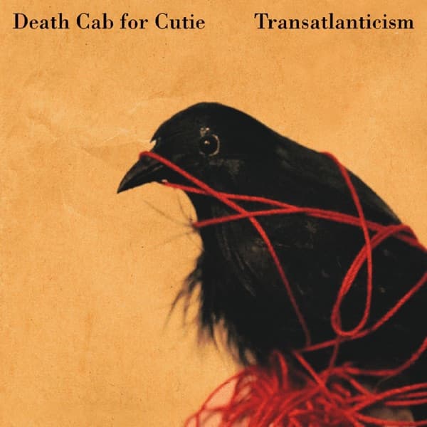
Transatlanticism by Death Cab for Cutie — album cover art

Transatlanticism by Death Cab for Cutie (2003)

Death Cab for Cutie's Transatlanticism cover was created by Seattle artist Adde Russell: a black bird tangled in vivid red string against a warm ochre field, developed from a white Styrofoam hobby-shop bird and credited to Russell for original artwork and layout.

Label
Barsuk Records
Designer
Adde Russell
Genre
Indie, Alternative
Decade
2000s
Read the full story →
Selected Ambient Works 85-92 by Aphex Twin — album cover art

Selected Ambient Works 85-92 by Aphex Twin (1992)

The debut album that launched ambient techno featured one of electronic music's most minimalist covers—just the Aphex Twin logo floating in stark white space. This radical simplicity perfectly matched Richard D. James's anonymous, mysterious persona and became a template for countless electronic releases.

Label
R&S Records
Genre
Electronic
Decade
1990s
Read the full story →
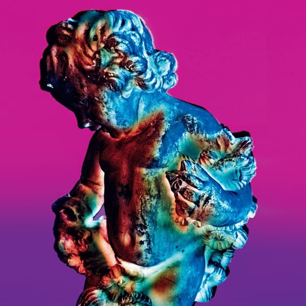
Technique by New Order — album cover art

Technique by New Order (1989)

Peter Saville's cover for New Order's Technique features a single lemon against stark white space, created using revolutionary computer imaging technology. The deceptively simple fruit became one of the most minimalist and mysterious album covers of the late 1980s.

Label
Factory Records
Designer
Peter Saville
Genre
Electronic, Alternative
Decade
1980s
Read the full story →
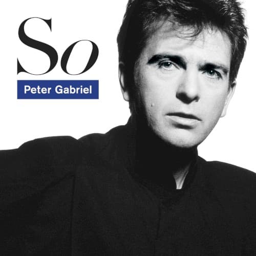
So by Peter Gabriel — album cover art

So by Peter Gabriel (1986)

So put Peter Gabriel's face at the center of the sleeve after years of more oblique cover concepts. Trevor Key made the close black-and-white portrait, Peter Saville designed the cover, and Brett Wickens created the distinctive So lettering. Saville later recalled using the same unusual Polaroid roll-film process he and Key had used for New Order's Low-Life portraits, combining photograph, typography and a blue campaign device into a deliberately recognizable identity.

Label
Geffen Records
Designer
Peter Saville · Brett Wickens (typography / design)
Photographer
Trevor Key
Genre
Rock, Pop
Decade
1980s
Read the full story →

Related design themes