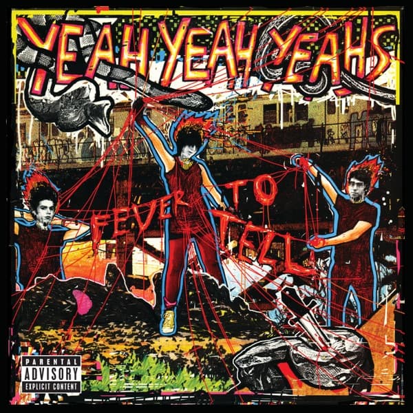
You can read a peeled-flyer logic all over the cover. Nothing sits flat. The three figures look scissored out of separate photographs and slapped down onto a torn-up backdrop, their edges left rough, shadows pooling under their feet as if they had been glued to the pavement. The city behind them, torn and re-pasted at angles that refuse to line up, reinforces the sense of layers stacked and ripped away.
Colour does the emotional work. The two outer figures are lit in hot red duotone, arms flung out, faces blurred, so they read as pure motion rather than portrait. The center figure holds the eye longer, planted in a red shirt and red trousers on scorched ground, hair spiked into a crown. Against the dark, cluttered field around them, the red pushes forward and everything else recedes into rubble.
The red string that laces through the composition ties the three of them into one frantic tangle, and it doubles as pure energy, the visual equivalent of feedback. It also controls the focal path. The eye can't settle: it snags on the center figure, slides down a red line to a fallen shape in the lower right corner, then gets yanked back up to the blurred faces on the edges. The composition is built to keep you moving, never resting.
The lettering carries the same handmade violence. Across the top, YEAH YEAH YEAHS is spelled out in fat, hand-drawn capitals filled with a checkerboard pattern, each letter jammed against the next and outlined in bright yellow so it buzzes against the dark chaos below. FEVER TO TELL is stacked in the middle in tall red type that bleeds into the red duotone bodies around it, so the words feel like part of the wreckage rather than a label placed on top of it. This is zine typography: nothing set clean, everything cut and inked by hand.
There is no polish here because polish was never the point. The sleeve wants to feel photocopied, stapled, taped to a telephone pole, the kind of image that looks better the more damaged it gets. The one note of corporate neatness is the small black-and-white Parental Advisory 'Explicit Content' label down in the bottom left corner, sitting like a found sticker in an otherwise handmade mess. That single flat rectangle throws the surrounding chaos into relief and quietly stages the tension between the corporate machine and the homemade riot wrapped around it.
The result sits in a specific punk lineage. It has been compared to Winston Smith's collage work for the Dead Kennedys' 'Give Me Convenience or Give Me Death,' and the comparison holds: both feel simultaneously nostalgic and contemporary, old cut-and-paste methods aimed at a present-tense target. What the image finally says is that these three belong to the same live wire, bound and jerked by the same current, and that the band's sound and its packaging refuse to pick a lane in exactly the same way.