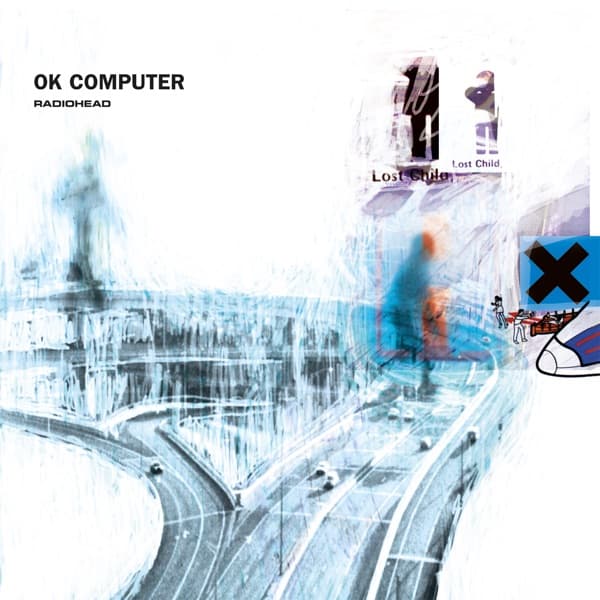
The first thing your eye does is fall, as if from a skyscraper or a plane window, into a tangle of motorway. Lanes peel apart and rejoin in a frozen interchange, cars reduced to grey specks crawling across a surface that has been scratched, bleached, and half-erased into a white haze. This is no anonymous road: fans later pinned it down as the I-84/I-91 junction in Hartford, Connecticut, the same city where Radiohead played in August 1996. The photograph has been edited until it reads less like a place and more like a memory of one, drained of warmth and dragged toward fog.
That fog was the whole point. Stanley Donwood, the band's long-time visual collaborator, said the blue-and-white palette came from 'trying to make something the colour of bleached bone.' He wanted 'a kind of fog world' of image fragments and found stuff, and you can feel it in how the road simply evaporates into white at the top of the frame, the way the entire left half of the cover bleeds into nothing but pale, frosted scribble.
OK Computer arrived in 1997, released on Parlophone in the UK on 16 June, and the sleeve was made the way the album was: alongside the recording sessions, on a newly acquired Mac. Donwood worked with frontman Thom Yorke, who hid behind the pseudonym 'the White Chocolate Farm,' scanning sketchbook drawings and found images from old textbooks and junk-shop magazines into the machine and collaging them together. Donwood drew directly onto the screen with a light pen and tablet.
They set themselves a rule that turns the whole cover into a quiet act of defiance: no using the undo key. Donwood believed that option simply doesn't exist in real life, so every mistake had to stay. You can see the consequences scattered across the image. Things are overlaid, doubled, or violently scratched out in white rather than deleted, because for him white was the colour of death, and erasure was a lie. Nothing here is clean. Everything carries its own corrections like scars.
The upper right is where the collage piles up thickest. A cluster of torn, pasted rectangles in bruised purples and greys carries the typed words 'Lost Child' twice over, like a misprinted notice that has been photocopied into incoherence. Below it sits a flat blue square stamped with a heavy black X, the universal pictogram for 'don't,' the kind you'd find on an airplane safety card. That is no accident: Yorke reportedly lifted an aeroplane emergency guide from a flight, and its language of warnings and prohibitions runs all through the artwork.
Next to that X, tiny cartoon figures wave at a blue jet, the cheerful diagram of a safe evacuation rendered as something faintly absurd. Two stick figures shaking hands recur in the package, on the liner notes and the disc itself, and Yorke explained them as a picture of exploitation: one figure being sold something they don't want, the other smiling and friendly only to close the sale. A handshake that is really a transaction. It is the album's anxiety about consumer life and dehumanised modernity, compressed into a doodle.
In the top left corner, sober and almost defiantly ordinary against the chaos, sit two lines of black type: OK COMPUTER in capitals, RADIOHEAD smaller beneath it. No flourish, no logo, just label-like clarity floating on the white. It lets the rest of the frame do the unsettling.
Years later these images by Donwood and Yorke were given a museum exhibition at the Ashmolean in Oxford, hung on gallery walls as art. It's a strange afterlife for a sleeve built from a stolen safety card, smudged motorway photography, and a refusal to undo anything. But that may be exactly why it holds: it looks like the inside of a mind that can see the whole interchange at once and still cannot find the exit.