
Pink Floyd

5 album covers in our archive

Pink Floyd is featured in Behind the Covers' archive with 5 album covers spanning the 1970s and 1960s. Released across Harvest/EMI and Columbia/CBS Records, Harvest Records, Harvest Records (UK) / Columbia Records (US), Harvest (UK) / Capitol (US) and EMI Columbia labels, the artwork sits in the rock tradition. Each cover is documented in our archive with design notes covering graphic design, minimalist, hand drawn, typographic, conceptual, photography. Below you'll find the full story behind each Pink Floyd cover — designers, photographers, label history, and the visual choices that defined the release.

The Wall by Pink Floyd — album cover art

The Wall (1979)

Pink Floyd's most stripped-down sleeve is a plain white brick wall, no text at all on the original. Behind it sits a feud, a fired design group, and a political cartoonist scribbling the title in red across a kitchen table in the South of France.

Label
Harvest/EMI and Columbia/CBS Records
Designer
Gerald Scarfe
Genre
Rock
Decade
1970s
Read the full story →
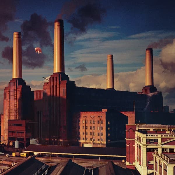
Animals by Pink Floyd — album cover art

Animals (1977)

A 40-foot helium pig named Algie floats between the chimneys of Battersea Power Station on Pink Floyd's 1977 cover. During the shoot it broke free, drifted into Heathrow's flight paths and grounded planes before landing in a Kent farmer's field. The image you see is a splice of two different days.

Label
Harvest Records
Designer
Storm Thorgerson
Photographer
Aubrey Powell
Genre
Rock
Decade
1970s
Read the full story →
Wish You Were Here by Pink Floyd — album cover art

Wish You Were Here (1975)

Two businessmen shake hands on a sun-baked studio backlot — and one of them is on fire. Pink Floyd asked Storm Thorgerson how to picture people who hide their true feelings, and he answered: 'Set a man on fire.' A real stuntman, fifteen takes, and a singed moustache later, here's the result.

Label
Harvest Records (UK) / Columbia Records (US)
Designer
Storm Thorgerson
Photographer
Aubrey Powell
Genre
Rock
Decade
1970s
Read the full story →
The Dark Side of the Moon by Pink Floyd — album cover art

The Dark Side of the Moon (1973)

A keyboardist asked for something as classy as a chocolate box. What he got was a beam of white light splitting into a rainbow against pure black, a design pulled from a 1963 physics textbook that would end up on more T-shirts than almost any image in rock. Here's how Pink Floyd's prism came to be.

Label
Harvest (UK) / Capitol (US)
Designer
Storm Thorgerson
Genre
Rock
Decade
1970s
Read the full story →
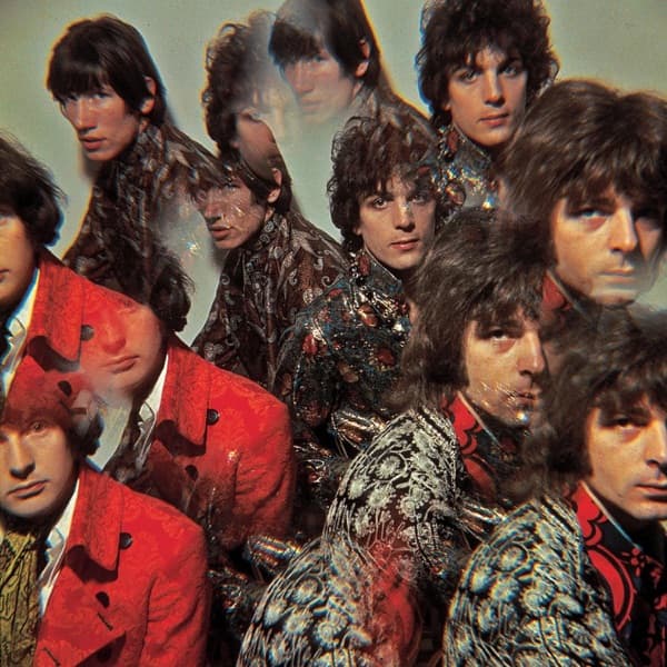
The Piper at the Gates of Dawn by Pink Floyd — album cover art

The Piper at the Gates of Dawn (1967)

A fashion photographer borrowed a prism lens from George Harrison, asked a brand-new, unsigned band to wear the brightest clothes they could find, and split their faces into a kaleidoscope. The result became the only Pink Floyd studio album to put the band's own faces on the front. Oh, and he reportedly never got paid.

Label
EMI Columbia
Designer
Syd Barrett
Photographer
Vic Singh
Genre
Rock
Decade
1960s
Read the full story →

Browse related design themes

More album cover stories from the 1970s