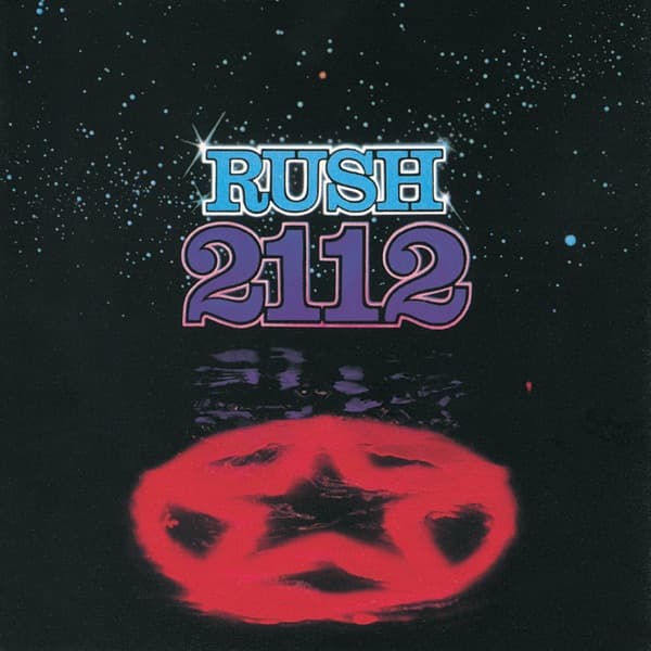
Stare into the lower half of this cover and a face seems to form inside the glowing red orb, a star burning at its center like an eye. That blood-colored star floats against a deep black field salted with blue and white pinpoints, a believable scatter of galaxy that recedes into nothing. Above it, the band name Rush sits in puffy chrome-blue letters lit with little starburst sparkles, and below that, 2112 swells in fat purple numerals outlined in pink. Between the typography and the star, the colors smear and ripple as if reflected on dark water. The eye lands first on that red glow, because everything else, the void, the lettering, the stars, frames it like an altar.
The star is not decoration. It is the Red Star of the Solar Federation, the symbol Neil Peart invented for the controlling, intolerant regime at the heart of the album's science-fiction story. The hero of that tale stands against it, and on this front cover the red star wins the frame entirely, a wall of menace with no human in sight.
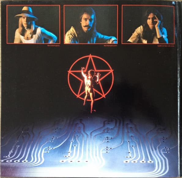
The man arrives elsewhere. Hugh Syme, the graphic artist behind this and nearly every Rush cover that followed, took two ideas Peart described to him, the evil red star and the nude hero who defies it, and simply combined them. The full naked figure, the so-called Starman, recoiling from the pentagram, lives inside the gatefold and first appeared on the back cover, not here on the front. His nudity was a nod to the long tradition of the unclothed figure in classical art and sculpture, the vulnerable individual against the machine. The model was Syme's own friend, Bobby King.
This was the first real collaboration between Syme and Peart, the drummer and lyricist, and Syme has been almost dismissive of the result, calling it pretty formative, pretty primitive. What he says he did was intuitive: he tapped into Peart's story of one hero confronting a tyrannical star and rendered it plainly. Neither he nor the band thought they were designing a logo.
They were wrong about that. The Starman escaped the gatefold and became Rush's emblem the world over. Syme has described his own surprise at finding the figure everywhere, stitched onto jackets, printed on T-shirts, inked as tattoos, and painted onto Peart's drum heads when Syme went to see the band play Massey Hall in Toronto. An image meant to illustrate a single album turned into an international shorthand for the entire band.
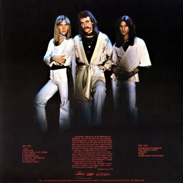
That 2112 existed at all was a near thing. Released in March 1976 on Mercury Records, it followed a stretch where the label had considered dropping the band and instead granted them one more album. Rush answered with a side-long progressive suite built on Peart's dystopian story, balanced by a second side that returned to their hard rock roots. It outsold everything they had done before and went on to move more than three million copies in the United States, remaining their second-highest seller and the record that kept their career alive.
Syme's fingerprints are on the music as well as the sleeve. He played the spacey synthesizer introduction to the title piece on his ARP synthesizer, and he handled keyboards on the song "Tears." The man who drew the red star also helped you hear the void it floats in. Look again at that face flickering inside the orb on the front cover, and the whole strange logic of the thing snaps into focus: a hero you cannot see, a tyranny you cannot miss, and an emblem nobody planned that outlived every intention behind it.