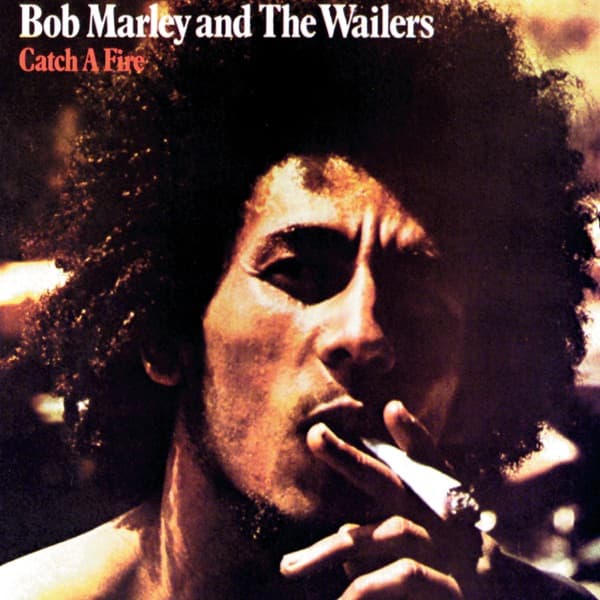


The first thing that catches you is the ember. Down in the lower right corner of the frame, a spliff burns orange against the dark, its ash glowing like a small coal, and a curl of smoke rising past Bob Marley's fingers as he draws on it. His eyes are half-lowered, focused somewhere past the lens, and warm amber light rakes across one side of his face while the other falls into deep shadow. His hair frames the whole image in a dark, backlit corona. In the top-left corner, clean white capitals read Bob Marley and the Wailers, with the title Catch a Fire just beneath it in red. It is a portrait built almost entirely of firelight and gloom.
But this was not the cover the earliest fans held. When Catch a Fire arrived in April 1973 as the Wailers' first album on Island Records, the very first 20,000 copies came dressed as something else entirely: a Zippo lighter.
That sleeve was the idea of graphic artists Rod Dyer and Bob Weiner, whom Chris Blackwell enlisted to design the original package. They rendered the album as a giant metal cigarette lighter, complete with a side hinge, so the whole thing opened like a clapperboard to reveal the record within. It didn't just depict a Zippo; it functioned like one, flipping open at the hinge the way a real lighter case does. The title turned into a physical joke you held in your hands. To catch a fire, you opened the flame.
The problem was practical. That die-cut, hinged construction was expensive to produce and fragile in the wild, and it was quickly discontinued after roughly those first 20,000 copies. Island switched to standard gatefolds. The most conceptually daring reggae sleeve of its moment survived as a short-run collector's object, retired before most of the world ever saw it.
What replaced it is the image on the sleeve here. Subsequent pressings carried an alternate cover designed by John Bonis, built around Esther Anderson's photograph of Marley smoking a spliff. The credit changed too: where the group had simply been the Wailers, the album was now billed as Bob Marley and the Wailers, quietly shifting the center of gravity toward the man whose face now filled the frame.
Look at how that photograph is lit and you understand why it traveled. Anderson's portrait is nearly cinematic in its contrast, the kind of low, single-source glow that carves a face out of blackness. Marley's brow is furrowed slightly, his lips parted around the spliff, and the smoke doesn't so much billow as drift, softening the edges of an otherwise sharp, intense expression. The warmth of the tones, all browns and oranges and reds, ties directly back to the fire in the title without needing a literal Zippo to say it. The flame simply moved from the packaging into the picture.
Anderson has said that this smoking image went around the world and helped launch Marley's career, and the claim is easy to credit when you see how completely the composition centers him. There is no band in the frame, no instruments, no stage. There is only a young man, a burning spliff, and light. It reads as an introduction: this is who he is, this is what he stands in.
The music inside had already been reshaped for a wider audience before this face ever went on the sleeve. After Marley returned to London with the tapes, Blackwell reworked the tracks at Island Studios, adding rock-oriented guitar overdubs from Muscle Shoals session musician Wayne Perkins to broaden the album's appeal. It was a deliberate bridge-building move, reggae recorded in Jamaica, then sweetened with rock guitar in a London studio, aimed at ears that had never bought a reggae record.
Seen against that backstory, the two covers tell the same strategy in different languages. The Zippo sleeve was a gimmick with genuine wit, a physical object that made you participate, flipping the lid to reach the vinyl. The Anderson portrait needed no mechanism at all. It sold the man directly, letting the glow on his face and the ember at his fingers do the work that a hinge once did.
The typography stays out of the way in service of that face. The block-lettered name and red title sit high in the corner, small enough that they never compete with the eyes or the smoke, letting the darkness hold the rest of the space. Nothing decorates the frame. The composition trusts the single figure completely, and that trust is exactly why the image outlasted the clever lighter it succeeded.
So there are really two artifacts here wearing the same name. One is a rare, breakable metal-lighter sleeve, a designer's dare that most people never touched. The other is a photograph of a face lit by fire, the version that kept printing and kept selling and became the way the world pictures the record. The first was designed to be opened. The second only had to be looked at.