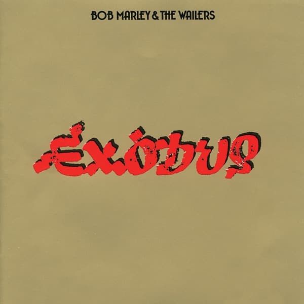
The canonical cover of Exodus does not show Bob Marley in silhouette, cosmic energy, a halo or a painted spiritual landscape. Neville Garrick's finished 1977 sleeve is almost the opposite: a metallic-gold field, the group name set small near the top, and the album title spread boldly across the center in distressed red lettering with dark edging. The word itself is the image.
That restraint came after Garrick had explored a far more literal concept. Bob Marley's official store documents an earlier design built around flight and migration: a green, gold and red-winged bird, Marley and the Wailers inside a global sphere, and Haile Selassie above, with imagery tied to the parting of the Red Sea. Garrick ultimately pivoted away from that composition to the now-classic gold cover. The contrast between those two ideas is central to the real design story: Exodus moved from illustrative narrative to a front sleeve dominated by a single word.
The finished object depended on production as much as illustration. The official Marley store describes the original artwork as a gold metallic jacket with embossed lettering. On a physical LP, that reflective gold surface gives the sleeve a material presence that flat digital reproductions can mute. The red-and-black title treatment cuts sharply across it, while the comparatively small artist name leaves the title with almost all of the visual weight.
Garrick's authorship is well established. The Bob Marley estate identifies him as the creative designer behind both the abandoned first concept and the final classic sleeve, while Eye magazine's long-form interview with Garrick discusses his broader approach to Marley covers and records his recollection that Exodus looked like a large-scale gold production. Garrick stressed that concept came first and that he designed in response to the music rather than applying a fixed visual formula.
The album's title also had unusually strong real-world context. After the December 1976 attempt on Marley's life, he left Jamaica and spent an extended period in London, where much of Exodus was recorded. Bob Marley's official album history gives the release date as June 3, 1977 and directly connects the London period to the aftermath of the shooting. That history makes the word Exodus resonant without requiring a fabricated portrait or cosmic scene on the front.
What makes the final cover effective is the refusal to over-explain. Instead of illustrating escape, migration or scripture with figures, Garrick lets scale, color, surface and the title carry the record. The visual drama is typographic and material: reflective gold against rough red lettering, with enough empty field around the word to make it feel monumental.