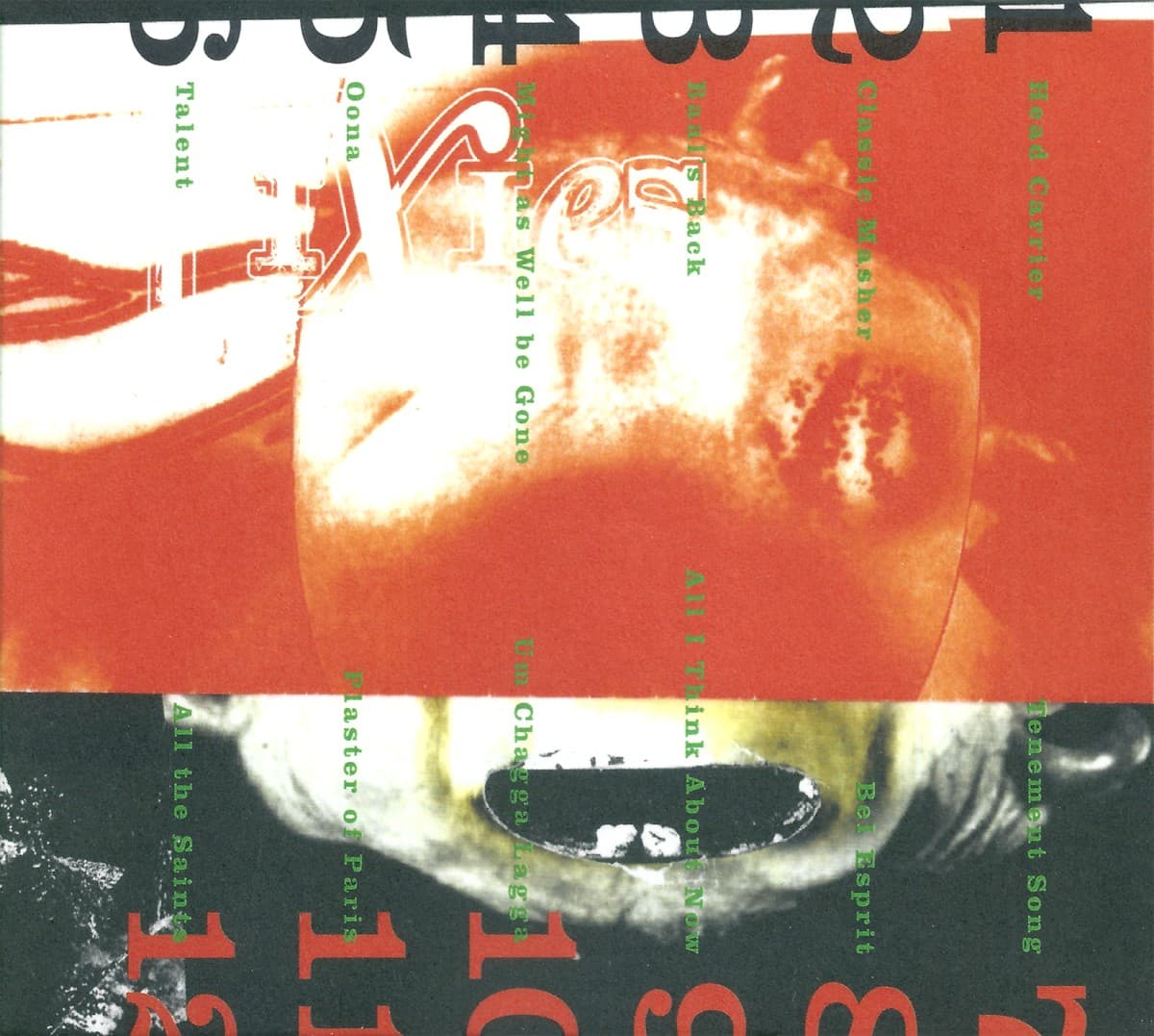

The Shape of Punk to Come does not look like an album waiting politely to be filed under punk. Its cover is a compressed field of red, black and white, with photographs, hard-edged type and documentary fragments competing for attention. The design feels closer to a political pamphlet or activist handbill than a conventional rock sleeve. That was not accidental.
The original packaging credits put singer Dennis Lyxzén at the center of the visual direction: art direction and layout are credited to him, with José Saxlund also credited for layout. Drummer David Sandström is credited with the photo collage. Ulf Nyberg supplied photographs of Refused, while Axel Stattin is credited for the back-cover photograph. Because those roles are distinct, this draft does not flatten the package into a single photographer credit.
Apple Music's editorial notes describe the front-cover collage as combining new technology, rioting, post-war swing dance and untethered expression. That mixture matters because the image does not offer one clean symbol for rebellion. It assembles different kinds of motion, conflict and social energy under a title that deliberately echoes Ornette Coleman's 1959 album The Shape of Jazz to Come. The reference is both homage and provocation: Coleman announced a challenge to the boundaries of jazz, while Refused used the same construction to challenge a fixed idea of punk.
The sleeve therefore works as more than period graphic styling. Refused were arguing against punk becoming a closed system with a fixed visual and musical vocabulary. The cover makes the same argument by refusing a single heroic image. It stacks photographs, documents and typography together so that history looks like material to be cut apart and recombined. The album's subtitle, A Chimerical Bombination in 12 Bursts, pushes the same logic: hybridization is the point.
The limited palette keeps that density from turning into decorative chaos. Red functions as signal and interruption. Black and white give photographs the harshness of reproduced newsprint. Typography behaves as another piece of collage rather than a neutral label. The cover looks inexpensive in the productive sense of the word: reproducible, distributable and closer to a flyer than luxury packaging. Yet the arrangement is controlled. The roughness is designed.
That visual method mirrors the music. The album breaks hardcore open with electronics, jazz-derived passages, spoken material and sudden shifts in dynamics. The sleeve performs an analogous edit in visual form. Each element retains traces of its source, but meaning changes when it is placed against something from a different context.
The record was released on October 27, 1998 through Burning Heart Records, with Epitaph distributing it in key markets. It was not universally embraced on arrival, but its reputation grew dramatically after Refused split. The package became inseparable from that afterlife: a visual declaration about punk's possible future attached to a record that increasingly came to be treated as predictive.
What makes the cover endure is that it refuses nostalgia even while quoting history. It borrows the title structure of a 1950s free-jazz landmark and uses archival-looking imagery, but the result is not retro. Everything is pressed into a late-1990s language of photocopied contrast, abrupt cropping and information overload. Refused were not asking what punk had looked like. They were asking what else it could become.