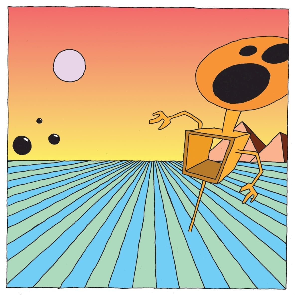
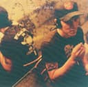
The cover of Emergency & I did not come from an outside design studio. Travis Morrison made it himself. Years later, when asked directly about the artwork, the Dismemberment Plan singer answered with self-deprecating precision: he was the one who moved the mouse and pushed the pixels.
That detail places the sleeve squarely in the late-1990s moment when musicians were beginning to have direct access to digital image-making tools without necessarily adopting the polished visual language of professional graphic design. Emergency & I looks strange because Morrison wanted strange, and because the imperfect digital quality became part of the image rather than something to disguise.
The strongest visual reference is not speculative. Morrison has confirmed that René Laloux's animated science-fiction film Fantastic Planet was a conscious influence. He had seen the movie as a child on late-night television and remembered it vividly. Its alien bodies, impossible scale and unsettling cartoon logic offered exactly the sort of vocabulary he wanted for the record.
Why did that vocabulary fit? Morrison connected the album to existential crisis, alienation and the frightening recognition that childhood is over. He said cartoonish elements helped him communicate states of high anxiety. That is a useful key to the cover because the artwork does not illustrate a song or depict a literal emergency. Instead it creates a world whose rules feel subtly wrong.
The image was not universally admired at the time. Morrison recalled people reacting as though it could not possibly be the real album cover and telling him it was terrible. He kept it anyway. Over time that supposed awkwardness became part of the record's identity; Morrison later noted that people had even tattooed the imagery.
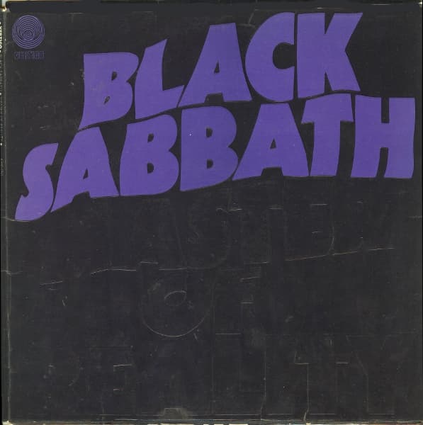
He compared the principle to Black Sabbath's Paranoid: a cover can become powerful precisely because its imagery is random, wrong or nightmarish rather than logically explanatory. Emergency & I works in that register. The distorted digital figures do not decode the songs. They make the viewer feel a version of the nervous energy already inside them.
That makes the cover unusually personal. Morrison was not only writing and singing about the instability of young adulthood; he was also building the visual world around those songs himself. The result retains the roughness of someone trying to translate a feeling into pixels before there was a settled visual template for what turn-of-the-millennium indie anxiety was supposed to look like.