The crab on The Fat of the Land was a last-minute solution, but it was not a photograph taken by the album's designer. The underlying wildlife image came from German photographer Konrad Wothe. Original release credits identify Wothe specifically with the front cover and note that the photograph was supplied through Silvestris / FLPA-Images of Nature.
That distinction matters because the sleeve was built from two separate creative acts. Wothe made the animal photograph. Alex Jenkins, then an in-house designer at XL Recordings, found the image and transformed it into The Prodigy's cover while working with Liam Howlett on the art direction.
The project nearly went in a completely different direction. Jenkins has described an earlier concept built around a real doner kebab. A kebab shop on Holloway Road was hired for a long shoot, and the album title was branded into the meat. Howlett changed his mind late in the process, leaving Jenkins to find a replacement under deadline pressure.
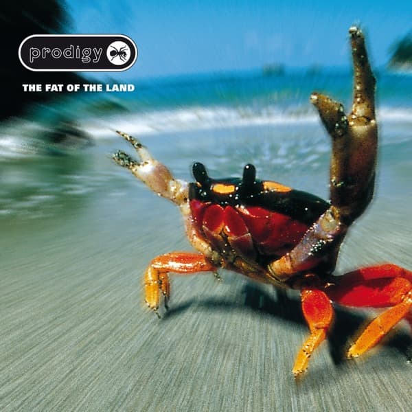
The replacement was Wothe's photograph of a land crab on a beach in Costa Rica. Release documentation and later cataloging identify the animal as a blackback land crab, Gecarcinus lateralis. Jenkins sent the candidate image to Howlett for approval, then pushed the photograph far beyond its documentary origin.
The most obvious alteration is the raised claw. Jenkins enlarged it so that the crab seemed to be making a rude, defiant gesture. He also treated the background to create the streaked sense of forward movement that makes the animal appear to be charging the camera. The finished cover therefore preserves Wothe's sharply observed wildlife subject while turning the surrounding beach into graphic speed.
Above the crab sits the redesigned Prodigy mark. The packaging dropped the word 'The' from the logo and added an ant silhouette, helping the album establish a harder visual identity for the band's 1997 breakthrough. The release credits spread that package across several contributors: Jenkins handled design and shared art direction with Howlett; Wothe supplied the front-cover photography; Terry Whittaker photographed the ant; JAKe contributed the band illustration; and other photographers supplied interior imagery.
The crab remains the part people remember because the transformation is so efficient. A small land animal, photographed in its natural environment, became enormous and belligerent once Jenkins changed the scale, claw and background. The cover's aggression comes less from what Wothe's crab was doing in real life than from what the design made the photograph feel like it was doing.
That is the cleanest story behind the image: Konrad Wothe took the photograph; Alex Jenkins turned it into The Fat of the Land. Keeping those roles separate gives both creators the credit the original package supports.