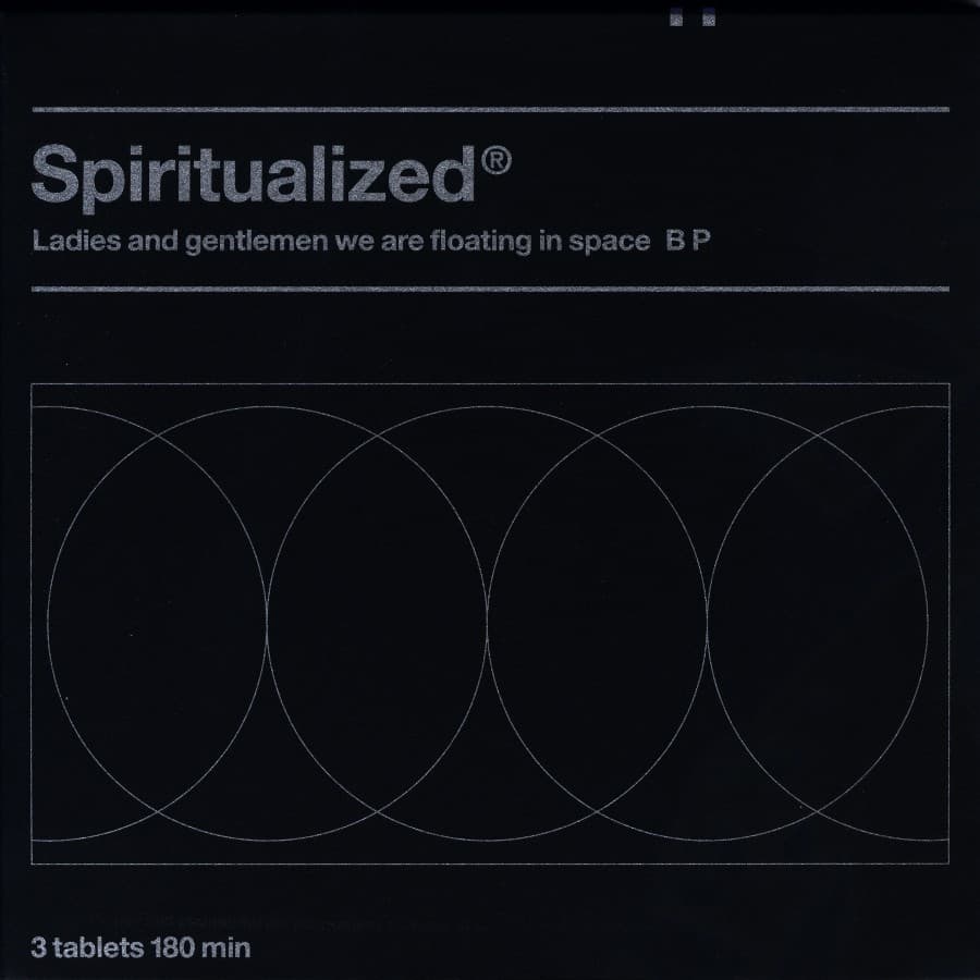

Some album covers try to suggest a mood. Ladies and Gentlemen We Are Floating in Space tried to change what an album physically was.
When Spiritualized leader Jason Pierce began discussing the record's packaging with designer Mark Farrow, he talked about music as medicine for the soul. Farrow took the phrase literally. The album would not merely borrow the visual language of pharmaceuticals; it would behave like a pharmaceutical product.
The special CD edition arrived in a white box resembling prescription medicine. Inside, the disc sat behind foil in a clear blister pack and had to be pushed through the backing like a tablet. The accompanying text mimicked dosage instructions and patient-information leaflets. Even the front's concise '1 tablet 70 min' language treated the album's running time as if it were a prescribed dose.
That commitment created practical problems. According to accounts of the project, the package had to be manufactured using processes associated with pharmaceutical packaging rather than ordinary record production. Pierce has recalled being frustrated by the interchangeable visual presentation of bands at the time and wanting Spiritualized releases to feel like objects with their own logic. This one took that impulse to an extreme.
The concept also fit the record unusually well. Ladies and Gentlemen We Are Floating in Space moves between narcotic calm, romantic collapse, gospel exaltation and overwhelming noise. Its songs repeatedly blur love, dependency, transcendence and chemical relief. Packaging the album as medicine did not need a slogan explaining those connections; the object itself made them unavoidable.
Farrow and Pierce also produced an even more elaborate limited version in which the twelve tracks appeared on individual three-inch CDs, each sealed separately in a large blister pack. The record became a course of treatment, broken into doses.
What could have been a novelty instead became one of the defining pieces of 1990s music packaging because the joke was carried all the way through. The typography, materials, structure and language all belong to the same idea. The cover does not decorate the record. It completes the metaphor.