
By the time Primal Scream released Screamadelica in September 1991, the band had already been changing in public. Andrew Weatherall's transformation of 'I'm Losing More Than I'll Ever Have' into 'Loaded' helped move them away from straightforward indie rock and toward a hybrid of gospel, dub, dance music, psychedelia and rock. The cover needed to feel just as liberated from ordinary rock presentation.
The image that did it came from Paul Cannell, an East London painter whose route into record sleeves had begun through Heavenly Recordings. Jeff Barrett had seen Cannell's work and commissioned him for Flowered Up's 'Phobia' single. That job led toward Creation Records and Primal Scream. Cannell then worked on the band's 1991 singles, including 'Higher Than the Sun' and 'Don't Fight It, Feel It,' establishing the bright, primitive visual vocabulary that would culminate in Screamadelica.
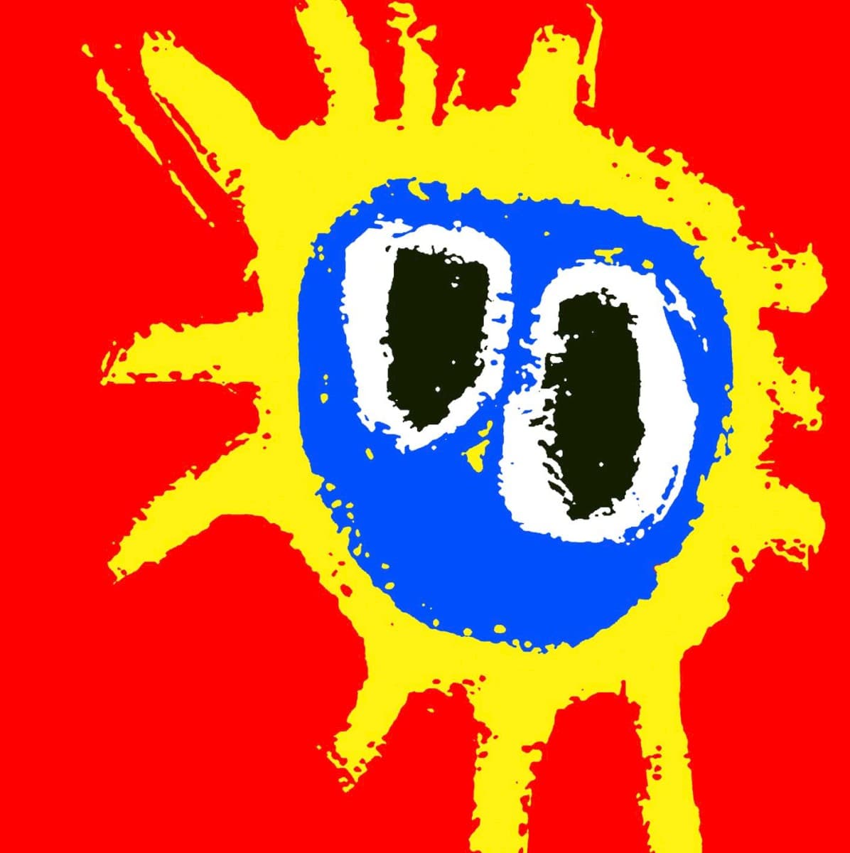
Cannell's famous face is deceptively simple: two eyes and radiating red-orange forms that can read as hair, flame, a sunburst or pure visual energy. The lack of realism is the point. Nothing about the image asks to be decoded as a literal portrait. Instead it behaves like a rave flyer, a child's painting, a hallucination and a pop logo at once. That ambiguity is one reason it reproduces so well at every scale.
Accounts of the image's origin have often repeated a story that Cannell was inspired by a damp patch or water stain on the ceiling of Creation's offices while under the influence of LSD. The story fits the mythology around the period, but it should be treated as an anecdotal recollection rather than the only explanation for the painting. Cannell himself had a broader set of visual influences. He spoke of admiring Picasso and the Impressionists, and the same loose, high-energy approach can be seen in his work before the album.
What is better documented is how naturally Cannell's work fit the band's immediate culture. He spent time around Primal Scream while Screamadelica was being made and described the atmosphere as an extreme version of sex, drugs and rock and roll. His paintings were not an outside agency's attempt to imitate acid-house aesthetics after the fact. They came from someone moving through the same social world.
The album sleeve also contains photography credited to Grant Fleming, but the front image is Cannell's artwork. Keeping those roles distinct matters because Screamadelica is so strongly identified with the painted face that other package contributors can disappear from memory. MusicBrainz's release credits identify Cannell for the cover image and Fleming for photography on the US release.
The face quickly became more than packaging. It functioned as a symbol for the entire Screamadelica era: on posters, shirts, reissues and stage visuals, it could stand in for the album without words. That is a rare quality. Many famous covers remain attached to the physical record; Cannell's image became an independent emblem.
Its afterlife has only strengthened that status. The Royal Mail included Screamadelica in its 2010 set celebrating classic British album covers, placing Cannell's work alongside sleeves such as London Calling and Parklife. For the album's 30th anniversary, the same motif was adapted onto a Fender Stratocaster. Bobby Gillespie has continued to credit Cannell's importance to the band's visual identity.
The cover works because it does not illustrate any particular lyric, scene or character. It illustrates a state of release. Screamadelica is a record about musical boundaries dissolving, and Cannell's face looks as if normal visual boundaries have dissolved too. It is simultaneously goofy, ecstatic, crude and iconic — a painted rush of sensation that became one of the defining images of British music in the early 1990s.