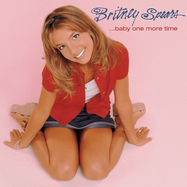

The first thing your eye finds is the color of nothing in particular: a wash of soft, uninterrupted pink that fills every corner of the frame, floor and background blurring into a single warm field. Against it kneels a young woman, folded down onto her shins, hands resting near her feet, tilting her face up toward the lens with a wide, unguarded grin. There is no set, no props, no story furniture. Just her, the pink, and the letters floating in the upper right.
Those letters do a lot of quiet work. Britney Spears is written in a looping, handwritten cursive script, blue ink curling into personal flourishes, the kind of signature a teenager might practice in the margin of a notebook. Below it, in small, lowercase, understated type, sits the title: …Baby One More Time, ellipsis and all. The contrast is deliberate to the eye: the name is playful and cursive and large, the album title is neat and almost shy. Together they read less like corporate branding and more like a note passed across a classroom.
Her styling is pure late-nineties casual. A cropped red short-sleeved shirt, buttoned partway over a plain white top, sits over a dark denim mini-skirt with visible stitching along the hem. On her wrist, a stack of thin white bangles catches a little light. Her hair falls in loose, honey-blonde layers around her shoulders, parted in the center, the ends flicking out. The pose is compact and low to the ground, knees together, feet tucked beneath her, so that the whole figure gathers into a small, friendly triangle at the bottom of the pink expanse.
What the composition really trades on is the smile and the eyes. She is looking straight up into the camera, chin slightly lifted, and the direct gaze pulls you in before you register anything else. It reads as approachable rather than posed, the expression of someone caught mid-laugh. Whoever framed this understood that the emptiness around her would force all attention onto that face. The pink is not decoration; it is a spotlight made of negative space.
Behind this single image sat a debut with real machinery under the hood. …Baby One More Time arrived on January 12, 1999, released by Jive Records, and it introduced a voice that would define a stretch of pop radio. The sound was not accidental. Working with Max Martin and Rami Yacoub, Spears landed squarely in the territory of polished pop and bubblegum pop, all bright hooks and clean, insistent production, the sonic equivalent of that candy-pink backdrop.
It is worth noticing how neatly the cover matches the music it wrapped. Bubblegum pop is built on immediacy, on melodies that plant themselves on first listen, and this photograph works the same way. There is nothing to decode. A girl, a grin, a wall of pink, a handwritten name. The image asks for no patience and rewards the glance, which is exactly what a debut single trying to conquer the radio needed to do.
The restraint is the strategy. Plenty of debut covers pile on concept and symbolism to announce an arrival. This one strips everything away and bets entirely on personality. By refusing scenery, the photograph turns Spears herself into the whole event. You are not being sold a mood or a world; you are being introduced to a person, one who looks like she is genuinely happy to meet you.
That directness is why the frame outlasted its moment. Two decades on, the picture had become shorthand for an entire era of pop. When Jive and Legacy Recordings, a division of Sony Music, marked the album's twentieth anniversary on November 23, 2018, they pressed it as a picture-disc vinyl. One side of the disc carried this very cover, the pink and the grin preserved intact. The other side offered a different view: an early-photoshoot image of Britney, folded into the object itself.
There is something fitting about that two-sided disc. The public face of the record, the one everybody memorized, spins on one side, while a quieter alternate take of the same young artist waits on the reverse. The anniversary edition literally built the myth and the making-of into a single rotating piece of vinyl, a small acknowledgment that the image the world knows was only one frame among many.
Look again at the cover and the confidence of the choice becomes clearer. No black bars, no dramatic lighting, no stylized darkness. Just warm pink light, a red shirt as the single bold accent, and a face angled up in welcome. The typography leans handwritten and personal precisely so the whole package feels like an introduction rather than a product launch. It says, here is a name you should learn, written out by hand.
The drama here is not in any hidden symbol. It is in how much a debut chose to leave out, and how completely one smiling frame did the job. The music built with Max Martin and Rami Yacoub supplied the hooks; the pink emptiness supplied the space to stare; and a teenager kneeling on the floor, looking straight up at whoever was holding the camera, supplied the rest.