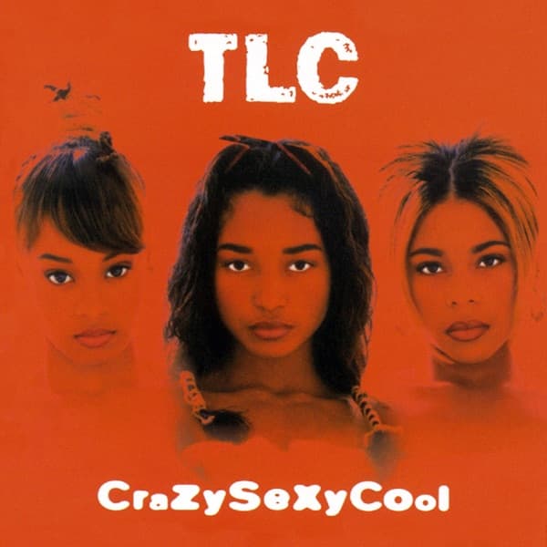
Three faces hover against a sea of scorching orange, and for a moment they seem to be dissolving into it. There is no room, no furniture, no horizon: just the flat, hot color and the trio of women looking straight out at you with an expression that refuses to explain itself. It is the first thing your eye lands on, that gaze, calm and level and slightly cool, three sets of dark eyes that hold the camera rather than the other way around.
This is CrazySexyCool, released on November 15, 1994, and the calm on those faces is doing a lot of quiet work. The public knew TLC as the group buried in baggy jeans and hoodies, oversized and playful and covered up. Here that armor is gone. The women appear with shoulders bare, collarbones catching the warm light, bodies no longer hidden but presented. The image reads as a deliberate reinvention, a shedding of the old uniform, and the neutral expressions make it feel less like a come-on than a statement of fact: this is who we are now.
The photograph is the work of Dah Len, and the composition is severe in its simplicity. The three heads are arranged across the frame, the central figure set slightly lower and more forward so her face becomes the anchor, the two others flanking her at the edges, each turned just enough to break the symmetry. Their hair is pulled up and back into tight styles with wisps and baby curls framing the brow, and the orange wash bathes their skin in the same molten tone as the background, so the figures and the field feel poured from a single color. Art direction came from Christopher Stern, with creative direction on the packaging by Davett Singletary, and the restraint pays off: nothing competes with the faces.
The title itself came from Left Eye, conceived on a trip to Europe, and it is not a phrase so much as a map of the group. Crazy is Left Eye, Sexy is Chilli, Cool is T-Boz, three temperaments folded into one word. The cover honors that logic by giving each woman equal weight in the frame while letting them stay distinct, three individuals rather than a matched set, unified only by the color that drowns them all.
Look at the typography and the split personality of the title comes alive. The band name at the top, TLC, is set in Frankie, a grunged, roughed-up cut of Franklin Gothic, its letters chipped and eroded at the edges like something stenciled and then scraped. It sits bold and white and immovable above the heads. The album title along the bottom, CraZySeXyCool, is set in Neville Brody's FF Blur Bold, its forms softened and smeared as if seen through frosted glass or heat haze, the capitals alternating rhythm through the word. Hard name, blurred title: rough and smooth, sharp and dissolving, the two typefaces stage the same tension the music does.
That music was contemporary soul at its most seductive, smooth and unhurried, powered underneath by new jack swing and hip-hop beats, the kind of hip hop soul that let a slow groove and a sung hook ride the same track. The cover's palette matches it exactly. Orange is warm without being sweet, a color of heat and dusk, and the softness of the lighting on skin and silk gives everything a low, glowing intimacy.
What the serene image cannot show is how troubled its making was. The recording was shadowed by Left Eye's struggles with alcoholism and a volatile relationship with Andre Rison, and her role on the album shrank while she was in rehab. On the cover she is one of three equal faces, whole and composed; the calm is partly a construction, the smooth surface stretched over a difficult year.
Whatever the strain behind it, the result rewrote the record books. Released on LaFace and Arista Records, the album was certified twelve-times platinum, diamond status, making TLC the first girl group ever to reach it. It has sold more than 23 million copies worldwide, the best-selling album by an American girl group, a number that dwarfs almost everything around it.
The reach outlasted the sales. CrazySexyCool landed on Rolling Stone's 500 Greatest Albums of All Time and in the book 1001 Albums You Must Hear Before You Die, the kind of long-tail recognition that keeps an album on shelves and in conversations decades later. The cover became shorthand for the record itself: mention the album and people picture the orange.
That staying power comes from how little the image tries to do. No busy set, no props, no explanatory scene, just three women, one color, three words, and a look that gives nothing away. It signaled a new confidence, the flat orange made the faces unforgettable, and the mismatched type let the word CraZySeXyCool feel like both a title and a self-portrait. The eye lands first on the center face and then travels out to the two at the edges, and by the time it reaches the smeared letters at the bottom, the meaning is already clear: three personalities, one heat, held in a single steady stare.