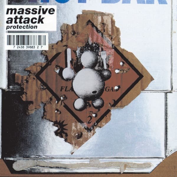
The canonical cover of Protection is not a blank white sleeve with delicate typography. The 1994 front is materially dense: a metallic-looking field is interrupted by torn and scorched-looking layers around a red flammable-gas warning diamond, while a rounded silver figure made from spheres — commonly known as Eurochild — sits over the center of the sign. Massive Attack's name and the album title appear as a comparatively small label in the upper-left area.
That matters because Protection visually follows Blue Lines rather than rejecting it. Massive Attack's debut had already made hazard-sign language part of the group's identity. Protection returns to that vocabulary in damaged form: the warning graphic appears burned, torn and mounted against something harder and more metallic. The relationship is visible before any interpretation is added. Even contemporary and later descriptions of the record note continuity between the two releases, including the reuse of the same heavy italic typographic identity.
The surviving release credits also contradict BTC's current creator model. Reproduced original-release metadata lists Massive Attack and Michael Nash Associates for artwork. Matthew Donaldson, Jean-Baptiste Mondino and Eddie Monsoon are credited for photography elsewhere in the package, but those credits should not be converted into front-cover photography without component-level evidence. The safest canonical creator line is therefore Massive Attack and Michael Nash Associates for artwork.
BTC previously attributed the sleeve solely to Tom Hingston. Hingston's collaboration with Massive Attack is important, especially around Mezzanine and later work, but the strongest release-level evidence reviewed for Protection names different artwork entities. This entry should not move that later collaboration backward into 1994 without an exact original-package credit supporting it.
The physical character of the sleeve is central to its effect. Pale metal, rust-brown torn material, black marks and the red warning sign create an industrial palette rather than the pure white field described in the old story. The Eurochild figure introduces an unmistakably figurative element, making the old claims of 'no figurative subject' and image-free minimalism literally incompatible with the artwork.
Protection is therefore more useful as a story about visual continuity, damage and transformation than as an invented lesson in white-space minimalism. Blue Lines establishes the hazard language; Protection shows that language altered and weathered. The cover keeps the system recognizable while making the surface feel as if it has been through an event.