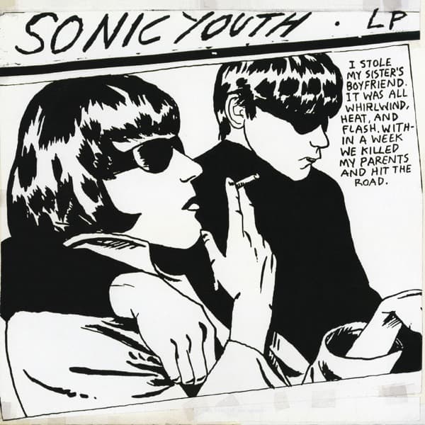
The eye lands first on the sunglasses — two pairs of them, jet-black and impenetrable, worn by a couple who fill almost the entire frame. Drawn in stark black ink on white, with no grey in between, the woman in the foreground has a leopard-spotted fringe and parted lips clamped around the slim line of a cigarette. Behind her, a man with slicked dark hair leans in close, his own shades catching a single white glint. It reads like a panel torn from a noir comic strip, all hard contour lines and high contrast, the kind of confident hand-drawn linework that doesn't need color to feel loud.
Across the top, in shaky capital letters, runs SONIC YOUTH . LP, hand-lettered as if scrawled with a marker. To the right, packed into the corner, is the line that has launched a thousand imitations: "I STOLE MY SISTER'S BOYFRIEND. IT WAS ALL WHIRLWIND, HEAT, AND FLASH. WITHIN A WEEK WE KILLED MY PARENTS AND HIT THE ROAD." The caption hits like pulp-novel dialogue — runaway lovers, blood, a getaway car — and your brain fills in the rest of a movie that doesn't exist.
Except the source is far stranger than fiction. This is the work of Raymond Pettibon, the artist who'd already burned his style into punk history with early covers for Black Flag. He based the drawing on a 1966 paparazzi photograph of Maureen Hindley and her first husband David Smith, snapped as they were driven to court. They were witnesses in the Moors murders trial — Maureen was the sister of Myra Hindley, and the couple's statements to police helped convict Hindley and Ian Brady. The cool mod glamour of the image carries a true-crime shadow most listeners never knew they were holding.
That tension — disposable cool over real horror — is exactly what makes the cover work. Pettibon had also sketched an alternative design featuring Joan Crawford, but Sonic Youth went with the sunglasses couple instead. Frank Olinsky handled the art direction, and the band's name and that runaway confession became the whole personality of the sleeve. No band photo, no logo polish — just a borrowed snapshot redrawn into something that feels both flirtatious and faintly criminal.
Goo arrived on June 26, 1990, the band's first album for Geffen's DGC imprint, and it landed right as alternative rock was about to crack the mainstream wide open. Coming from the noise-rock underground onto a major label, Sonic Youth could have softened. Instead they led with a Pettibon drawing — a gesture that kept one foot firmly in punk's DIY visual world even as the music reached a bigger audience. Critics raved, and the record became part of the early-90s commercial breakthrough that reshaped what major labels were willing to sign.
The afterlife of the image may be its strangest chapter. The composition — two heads, the speech-bubble caption, that confessional voice — proved so endlessly remixable that it became a template. The faces have been swapped for characters from Peep Show, Rick and Morty, Stranger Things and countless other shows, the layout instantly recognizable even to people who've never heard a note of the band. A single ink drawing became a meme format decades before the word meant anything.
And it climbed the cultural ladder, too: the artwork now lives in the collection of the Museum of Modern Art, filed under both Sonic Youth and Raymond Pettibon. A redrawn tabloid photo, captioned with invented pulp menace, slapped on a noise-rock record — and it ended up on a museum wall. The two figures keep sharing their cigarette behind their black lenses, giving away nothing, which is precisely why people can't stop looking.