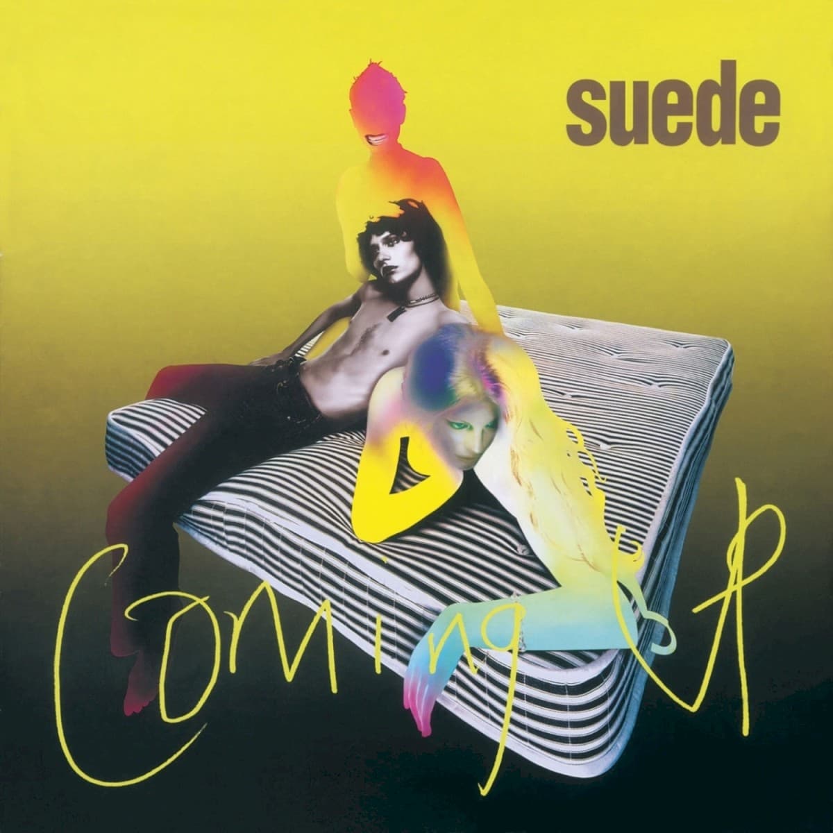

Coming Up looks as though a fashion photograph has been left under a chemical lamp. Three bodies spill across a striped mattress, but ordinary skin tones have been replaced by electric yellow, red, blue and green. One figure sits upright behind the others; another reclines across the bed; a third leans forward into the foreground. The photograph is recognizable as a photograph and yet refuses to behave like one.
That was an appropriate change of visual temperature for Suede in 1996. After the dark, cinematic grandeur of Dog Man Star and the departure of guitarist Bernard Butler, the band returned with Richard Oakes, Neil Codling and a record deliberately built around brighter, more immediate pop songs. Brett Anderson wanted the sleeve to participate in that reinvention, and he approached Peter Saville—the designer whose work for Joy Division and New Order had already become part of British music's visual canon.
Saville initially thought there was a generational problem. He was around forty; Anderson was in his twenties. Saville later recalled telling Anderson that he should work with designers closer to his own age. Anderson wanted Saville precisely because his visual signature mattered. The collaboration went ahead, with Saville acting as art director and bringing fashion photographer Nick Knight into the project.
The finished sleeve credits are unusually collaborative. The cover itself is credited to Nick Knight, Peter Saville and Brett Anderson. Howard Wakefield at The Apartment handled the graphic design, while Steve Seal supplied paintbox work. The three cover models are credited as Lee, Leah and Paula. Donald Christie photographed the band elsewhere in the package, but the front-cover imagery belongs to the Knight/Saville/Anderson collaboration rather than Christie's band portraits.
The mattress is more than a convenient prop in Suede's visual history. Anderson has spoken about his fascination with beds as places that can mean refuge, reflection and warmth but also intensity, passion, humiliation and regret. Coming Up continued a motif that had appeared in Suede's imagery before it and would return again later. Here the bed is not lonely or melancholic. It is crowded, bright and charged with bodies.
The treatment also places the cover firmly inside the visual culture Suede were writing about. Anderson's songs on Coming Up move through glamour, drugs, sex, celebrity and the beautiful wreckage of mid-1990s nightlife. Knight and Saville's image does not illustrate any one lyric. Instead it creates the same atmosphere: fashionable but unstable, seductive but slightly unreal. The figures look less like conventional portraits than people caught inside a neon afterimage.
Even the title works differently because of the design. Howard Wakefield's loose handwritten Coming Up sprawls across the lower half of the sleeve, cutting over the mattress and bodies rather than sitting politely outside the photograph. The small black suede wordmark at the top is comparatively controlled. The tension between those two kinds of typography mirrors the picture itself: a recognizable structure overwhelmed by something more impulsive.
Thirty years later, the original team has effectively been invited back into the artwork. For the 2026 anniversary edition, Wakefield returned to restore the original photography and art direction for new packaging. That makes Coming Up unusual even among anniversary reissues: its cover is not merely being reproduced but revisited by the designer who assembled it in the first place.