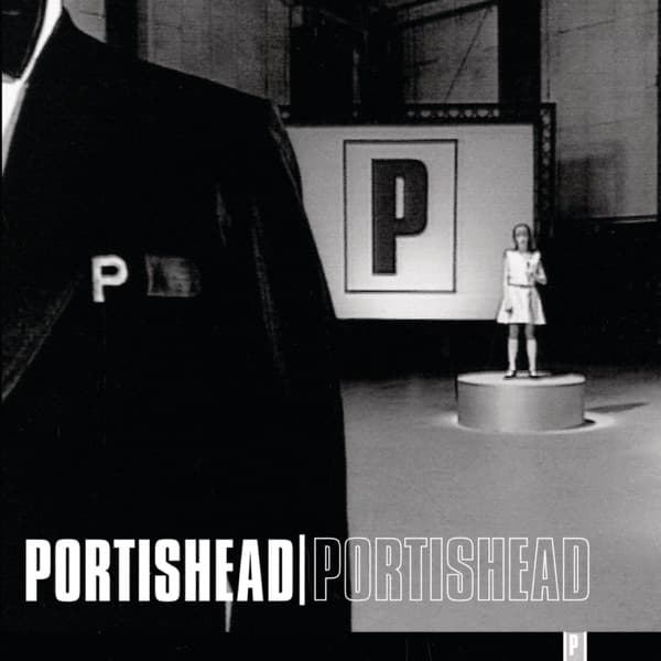
The first thing that hits you is the imbalance. A vast black shape, the shoulder and lapel of an oversized suit, crowds the entire left side of the frame like a wall of fabric, while across a bare grey floor a tiny girl in a pale dress stands on a low circular pedestal, dwarfed and exposed. Between them, a huge illuminated panel glows with one letter: P, boxed and clinical. The whole thing is drained of colour, a grainy black-and-white world lit like an interrogation room or an empty soundstage.
That single letter is everywhere. It sits on the lapel of the giant suit, small and stitched like a uniform badge. It blazes from the lightbox on the back wall. It appears again, tiny, in the lower right corner beside the floor. The eye ping-pongs between the enormous P on the wall and the miniature figure of the child, and the tension between scale and stillness is the whole composition. Nothing is decorative. Everything points inward to that emblem.
This is the cover of Portishead, the band's second studio album, released on 29 September 1997 on Go! Beat. The image is not a posed photo shoot but a still lifted from the music video for the song 'All Mine', a frozen frame from motion, which explains its strange cinematic depth: the receding floor, the theatrical spotlight glow, the sense that the figures were caught mid-scene rather than arranged for a camera.
The man responsible for turning that frame into a sleeve was Marc Bessant, the band's long-time associate who shaped their visual identity across their records. He set out to make this the most austere cover the group had ever put their name to. He called it essential minimalism, a design stripped to reflect how raw and uncomplicated the difficult-to-make record underneath actually was. Look at the sleeve and you can read that intent in every choice: no photograph of the musicians, no colour, no clutter, just a grey void, a looming silhouette, and a logo.
That logo carries a small, almost accidental history. The P did not come from a graphic designer's sketchbook in the usual sense. It reportedly began as an old Phillips logo spotted on a piece of equipment Geoff Barrow had lying around, an industrial badge repurposed into a band emblem. By this 1997 album, Bessant considered the mark to have reached the peak of its original form, and the cover treats it accordingly, presenting it not once but three times, at wildly different sizes, as though branding the entire scene.
The typography at the bottom hammers the same idea home. PORTISHEAD | PORTISHEAD runs across the base of the sleeve in bold sans-serif capitals, the name printed twice, once solid white and once in outline, split by a vertical bar. It reads like a stamp, a repetition, an insistence. The doubling of the word matches the doubling of the album's self-titled status: band name, record name, same word, said twice.
There is something quietly unsettling in the human content of the frame. The oversized suit with no visible face, the solitary child raised on a plinth like an exhibit, the empty industrial floor between them. It plays like a scene from a dream you cannot quite explain, and it suits the music it wraps. Reviewers greeted the album as darker and more haunting than the band's debut, Dummy, and the sleeve delivers that mood before a single note plays: cold light, deep shadow, isolation, unease.
The restraint was a gamble that paid off. Critics in Q, The Guardian, Spin and AllMusic praised the record, and it climbed to No. 2 on the UK Albums Chart while reaching No. 21 on the Billboard 200 in America. For a work classified as trip hop and electronica, built on beats and dread rather than easy hooks, that reach was considerable, and the austere black-and-white packaging never softened its edges to court it.
What makes the cover work is precisely what it refuses to do. It does not show you the faces of the people who made the music. It does not seduce with colour or spectacle. It gives you a giant, a child, a floor, and a letter, and it lets the imbalance do the talking. The huge dark suit occupies more of the frame than anything else, yet the eye keeps returning to the small bright figure on the pedestal, because vulnerability draws attention more than mass.
There is a neat honesty in a band whose emblem came from a discarded piece of gear choosing, for their second album, to build their most stripped-back sleeve around exactly that mark. No painter, no illustrator, no glamour. A still from their own video, a logo born of salvage, and a designer determined to match the picture to the difficulty of the record. Standing in that grey room with the child, the giant and the glowing P, you get the feeling nothing here is accidental, even the parts that started as accidents.