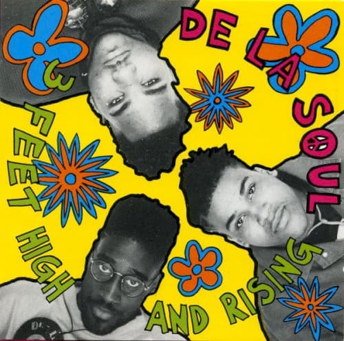
The cover of De La Soul's 1989 debut announced a new visual vocabulary for hip-hop with the force of a paint bomb detonating in a monochrome room. In an era when hip-hop album covers were dominated by urban grit, gold chains, and hard stares, De La Soul's cover exploded with daisies, peace signs, and a kaleidoscopic color palette that drew from 1960s psychedelia, African textile patterns, and the cheerful excess of Saturday morning cartoons. The design, created by the trio in collaboration with their visual team, was as revolutionary in hip-hop's visual culture as the album's sample-heavy, jazz-inflected production was in its sonic landscape.
The central image features the three members of De La Soul, Posdnuos, Trugoy, and Maseo, rendered in or surrounded by a riot of floral and geometric imagery. Daisies recur throughout the composition, establishing the daisy-age aesthetic that would define the group's visual identity and inspire an entire subgenre of alternative hip-hop. The flowers are not rendered naturalistically but as bold, flat graphic elements, their simple petal forms repeated and scaled to create patterns that cover every available surface like wallpaper from a psychedelic commune.
The color palette is aggressively cheerful: bright yellows, oranges, reds, greens, and pinks collide across the surface without regard for conventional harmony. The saturation is pushed to maximum, every hue competing for attention, creating a visual experience that is simultaneously joyful and overwhelming. This chromatic excess mirrors the album's production style, which layered dozens of samples into dense, maximalist collages that rewarded repeated listening with new discoveries each time.
The composition has the horror vacui quality of outsider art or folk textile design: every inch of surface is filled with imagery, pattern, or color, leaving no negative space for the eye to rest. Daisies, peace signs, the group members' faces, and abstract decorative elements tessellate across the cover like tiles in an elaborate mosaic. This density creates a visual richness that photographs poorly and must be experienced in person, making the physical album sleeve an essential component of the aesthetic experience.
The typography integrates the group name and album title into the overall decorative scheme, rendering the text in fonts that are as colorful and playful as the surrounding imagery. The letters are thick, rounded, and organic, resembling the bubble lettering of graffiti culture but translated into the softer, friendlier register of flower power. The text does not sit above or below the image but within it, participating in the visual democracy of the surface where no element claims priority over any other.
The daisy motif was not merely decorative but strategic. By associating themselves with peace-and-love imagery that mainstream culture considered outdated, De La Soul signaled their rejection of hip-hop's increasingly narrow definition of authenticity. You did not need to be hard to be hip-hop, the cover argued; you could be gentle, eccentric, intellectual, and humorous while still being genuinely Black and genuinely creative. The daisies were a provocation wrapped in petals.
The back cover and gatefold extend the visual maximalism with additional layers of imagery, credits rendered in the same playful typography, and a color palette that refuses to quiet down for even a moment. The entire package is designed to be handled and explored, with details that reveal themselves over time, rewarding the same kind of deep attention that the album's intricate production demands.
3 Feet High and Rising's cover art was as influential as the music it contained. It opened a space in hip-hop's visual culture for color, humor, and psychedelic imagery that had been closed since the genre's earliest days, and it established the template for alternative hip-hop's visual identity. The Daisy Age aesthetic that the cover inaugurated influenced everyone from A Tribe Called Quest's earth-toned Afrocentrism to Tyler, the Creator's candy-colored maximalism, proving that hip-hop's visual language was as expandable as its sonic one.