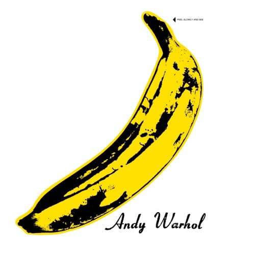
Almost nothing is on it — and that's the audacity. A lone banana floats on a field of stark white, rendered in bright cartoon yellow with rough black shadows splotching its skin like printer's ink that refused to behave. The stem hooks to the upper left, the body curves down to the right, and along the bottom, in a looping handwritten signature, two words: Andy Warhol. In the top corner, small block letters read "PEEL SLOWLY AND SEE," with a little arrow pointing at the tip. The eye lands on the fruit first, then on that strange invitation, and the whole sleeve becomes a dare.
That dare was literal. On early pressings of The Velvet Underground & Nico, the banana was a sticker you could actually peel, revealing a flesh-colored banana underneath. Pulling it back was the point. Warhol biographer Blake Gopnik later compared the gesture to peeling back a foreskin, arguing the jacket tied the band to the queer culture of Warhol's Factory. Whatever you read into it, the banana made it into an erotic art show — a fact Lou Reed seemed to relish recounting.
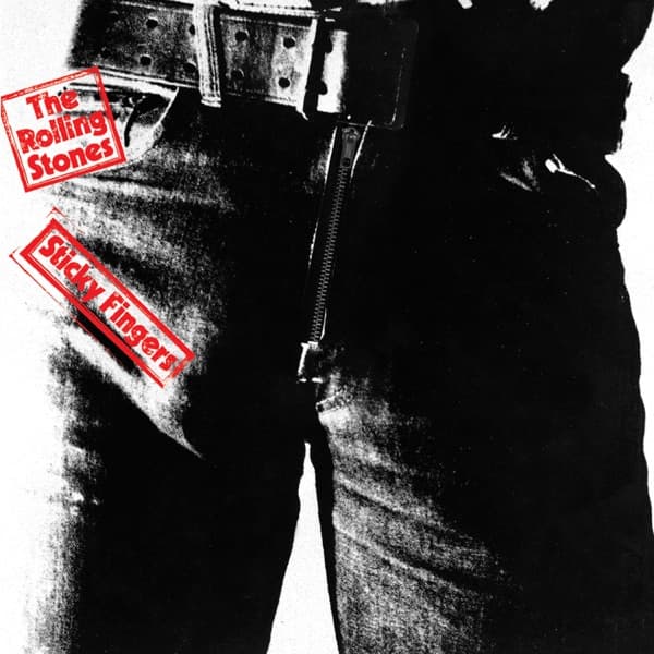
Warhol wasn't just the artist whose name sits in cursive at the bottom; he managed the band and was the one who paired them with Nico. Designer Acy R. Lehman turned the concept into an unusually expensive gatefold, and the peelable mechanism required a special machine to manufacture — a delay that pushed the release back. MGM, the parent of Verve Records, paid the bill anyway, betting that Warhol's name would move copies. The engineering behind the working sticker was quietly solved by Craig Braun, who went uncredited but later built the functioning zipper for the Rolling Stones' Sticky Fingers.
The bet didn't pay off. When the album arrived in March 1967, it crawled to #171 on the Billboard 200 and generated roughly $22,000 in royalties across its first two years. The cover that cost so much to print was wrapped around a record almost nobody bought.
There was trouble on the other side, too. The back cover, shot at Warhol's Exploding Plastic Inevitable, showed actor Eric Emerson's image projected upside-down behind the band. Emerson, broke after a drug arrest and looking for money, threatened to sue — and MGM recalled the album to airbrush him out, costing the band even more momentum.
The banana's afterlife proved far stranger than its sales. Original copies with an unpeeled, still-working sticker became rare collector's items, since most reissues simply printed the fruit flat. And in January 2012, the Velvet Underground partnership of John Cale and Lou Reed sued the Andy Warhol Foundation after it licensed the banana to Incase Designs for iPhone and iPad cases, claiming the image had become the band's own trademark. The Foundation answered with a binding promise never to sue over it.
The joke, in the end, is on everyone who underestimated it. A piece of fruit drawn in three colors, signed by a Pop artist, slapped on a commercial flop — and in 2023 Billboard placed it at the very top of its ranking of the 100 best album covers ever made. The instruction still stands at the corner of the sleeve, as patient as the day it was printed: peel slowly, and see.