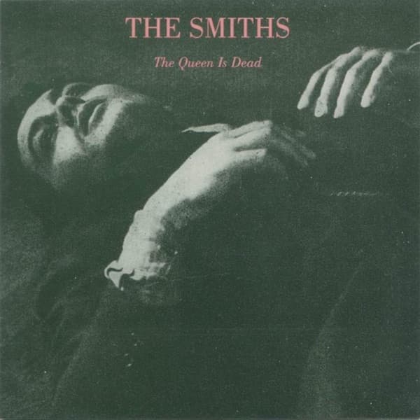
Morrissey chose the cover image for The Smiths' 1986 masterpiece himself, as he did for every Smiths release, selecting a still of the French actor Alain Delon from the 1964 film L'Insoumis, directed by Alain Cavalier. The photograph shows Delon in a military setting, his face turned slightly away from the camera, his expression carrying the melancholy beauty that Morrissey prized above all other qualities in his visual icons. The choice was entirely consistent with the Smiths' established cover aesthetic: repurposing images of cultural figures from the past to create a visual mythology that was simultaneously nostalgic and subversive.
Delon in the photograph embodies a specific kind of European masculine beauty that fascinated Morrissey: dark-eyed, angular, simultaneously tough and vulnerable, conveying emotion through restraint rather than display. The still is from a film about French military deserters during the Algerian War, and Delon's character carries the weight of moral complexity that the film's narrative demands. Morrissey, characteristically, was less interested in the political context than in the visual and emotional qualities of the image: the beauty of a man caught between duty and conscience, between action and withdrawal.
The composition of the film still places Delon slightly off-center, his face in three-quarter profile, with a blurred military background that suggests both institutional authority and its dissolution. The shallow depth of field, natural to cinema photography, isolates Delon's face as the single point of sharpness in a world that has gone soft, an apt visual metaphor for the Smiths' relationship to 1980s British culture, where they remained stubbornly focused while everything around them blurred into synth-pop conformity.
The color palette has been desaturated almost to monochrome, with only the faintest warmth in Delon's skin tones and the olive-grey of his military clothing distinguishing the image from true black and white. This near-monochrome treatment was a Smiths signature, applied to nearly all their releases, creating a visual brand of romantic austerity that stood in stark contrast to the neon excess of mid-1980s pop design. The muted tones communicate seriousness, historical depth, and a deliberate rejection of contemporary visual fashion.
The text treatment adds the band name and album title in a typeface that appears hand-stamped or transferred, with a quality of deliberate imperfection that suggests fanzine culture rather than professional graphic design. The letters are not perfectly aligned, and their weight is slightly uneven, creating a lo-fi aesthetic that communicates authenticity and the hand-made. The word "DEAD" in the album title sits with quiet provocation on the cover, its morbid directness balanced by the visual beauty of Delon's face.
Morrissey's method of appropriating existing images for Smiths covers, selecting photographs of actors, poets, and cultural figures he admired and repurposing them as album art, was a form of cultural curating that anticipated the remix and sampling culture of the digital age. Each cover selection was a statement of affiliation, a declaration of the cultural lineage in which Morrissey wished to place the Smiths. Delon on The Queen Is Dead places the band in a tradition of European art cinema, existential masculinity, and anti-colonial politics, whether or not the listener recognizes the reference.
The back cover continues the cinematic theme with additional imagery and the track listing rendered in the same hand-stamped typography. The overall packaging has the quality of a fan's personal archive, a scrapbook of beloved images assembled with the obsessive care of someone who finds more meaning in other people's art than in their own reflection. This is, of course, the Smiths' emotional territory: the songs are filled with cinematic references, literary quotations, and borrowed personae, and the covers are their visual equivalent.
The Queen Is Dead's cover has become one of the most recognized images in independent music, not because of its graphic design innovation but because of the emotional intelligence of Morrissey's image selection. By choosing Alain Delon at his most vulnerably beautiful, Morrissey created a visual icon for the album's themes of desire, defiance, and the refusal to accept the world as it presents itself. The cover taught a generation of indie musicians that visual identity could be constructed through curation rather than creation, and that the right borrowed image could communicate more than any original photograph.