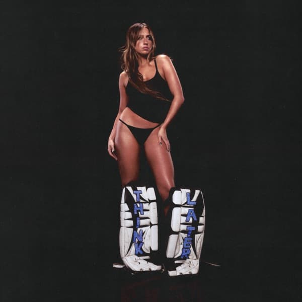
The Think Later album cover begins with a bold statement about home. When Tate McRae conceptualized the artwork for her sophomore album, she opted to be photographed wearing hockey knee pads painted with the album title – a direct tribute to her Calgary origins.
The cover art concept emerged from McRae's embrace of her Canadian identity. Having spent years trying to escape Calgary for Los Angeles and the music industry, she reached a turning point where she started to "fall in love with [her] roots." Hockey became the perfect visual metaphor, representing both her hometown and family connections.
The album photoshoot took place on October 23, 2023, with visual shoots following on November 26. The striking composition shows McRae standing above white hockey goalie pads with black trim, the album title "THINK LATER" painted in bold blue lettering across the equipment.
Bradley J. Calder served as creative director for the entire project, overseeing the visual concept and execution. His role extended beyond the album cover to include creative direction for related promotional materials and music videos.
Conor Cunningham captured the photography for the cover, working under Calder's creative direction. The shoot also involved stylist Joanie del Santo, with styling assistance from Natalie Smithson, hair by Chad Wood, and makeup by Lily Keys Westbrook.
Quincy Banks handled the design elements, ensuring the typography and layout complemented the photographic concept. The design work balanced the stark simplicity of the hockey equipment against the album's title treatment.
The cover generated positive reception as part of the album's overall campaign. Critics noted how the visual aligned with the album's themes of youth, spontaneity, and embracing one's authentic self, particularly McRae's connection to her Canadian identity.
Visually, the cover employs a minimalist approach with a stark black background that makes the white goalie pads the focal point. The blue lettering provides the only color accent, creating a clean, athletic aesthetic that reflects both McRae's dance background and her newfound appreciation for her hockey-centric hometown.
The typography choice for "THINK LATER" uses a bold, sans-serif treatment that mirrors the directness of the album's concept. The text placement across the hockey equipment creates an integrated design where the sporting goods become the canvas for the album's identity.
The cover art represents a significant evolution in McRae's visual identity, moving away from more conventional pop imagery toward something uniquely personal. This approach influenced how other young pop artists began incorporating personal cultural elements into their album artwork.
The hockey theme extended throughout the album's promotional materials, creating a cohesive visual campaign that reinforced McRae's embrace of her Calgary roots. The imagery became synonymous with her artistic maturation and her willingness to celebrate rather than hide her Canadian identity.
The cover's success lay in its authentic representation of McRae's journey – from a teenager wanting to escape her hometown to a young woman proud of where she came from, literally standing over the symbols of her heritage.