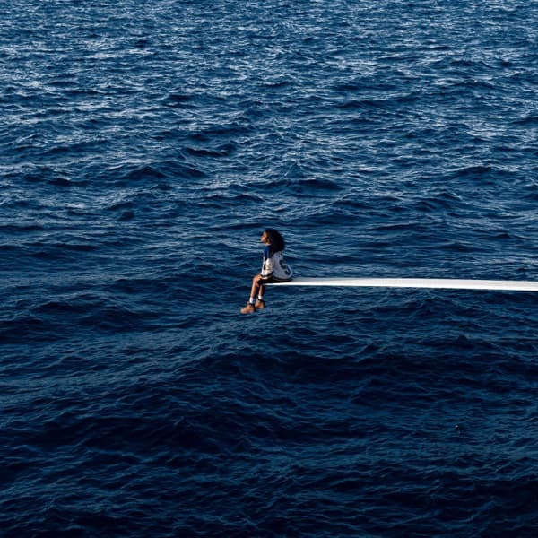


The SOS cover is built on distance. SZA is not plunging into the water; she is sitting alone at the very end of a white diving board, surrounded by so much blue that the ocean seems to erase the rest of the world.
SZA has explained where the composition came from. While developing the artwork, she pulled a 1997 photograph of Princess Diana sitting alone on a diving board aboard a yacht. What mattered to SZA was the feeling in the image: Diana looked isolated. That was the emotion she wanted the SOS cover to carry.
The original plan was different in one important respect. SZA said the shoot was supposed to place her on a shipping barge. When the team could not get clearance for the barges they wanted, they built the diving-board setup instead. The final photograph preserved the emotional reference while turning it into a stripped-down image: one person, one narrow platform and an expanse of water.
That distinction matters because the finished sleeve is about stillness, not action. BTC's old version treated the image as a backward dive and built an entire production story around repeated plunges into murky water. The actual front freezes SZA before any such action: seated, small in the frame and visually separated from anything that might anchor her.
The title SOS gives the open water an obvious maritime association, but documented production facts and interpretation should stay separate. SZA's own explanation specifically emphasizes isolation. Readings involving drowning, baptism, rebirth or emotional submersion can be discussed as interpretation, but not presented as the concept she stated.