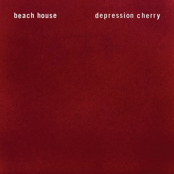
The first thing your eye does with this cover is search for a picture, and the first thing it learns is that there isn't one. There is only red: a deep, bruised, wine-dark crimson that fills the entire square, mottled and cloudy like fabric caught in raking light. Two lines of small white lowercase type sit at the top, evenly weighted, like a pair of eyes: beach house on the left, depression cherry on the right. No image, no faces, no photograph of the band. Just color and words and a surface that looks like it wants to be touched.
That impulse to touch is not accidental. The physical vinyl and CD copies of Depression Cherry came housed in a sleeve lined with actual red velvet, so the packaging was literally soft under the fingers. What you see on screen is a flat reproduction of something that, in the hand, had nap and warmth and weight. The mottled texture in the red, those darker patches pooling toward the corners, reads exactly like velvet catching shadow, the pile brushed one way here and another way there.
The design studio Post Typography, who built a companion poster for the release, framed the whole object with a single sharp idea: this was a record 'meant to be held rather than "liked" on the internet.' That sentence explains the cover better than any color theory could. In an era when an album lives as a thumbnail, Beach House and their collaborators made a deliberately physical, anti-digital thing, and then gave it a cover that punishes the screen. Reduced to pixels, it is just a red rectangle. In your hands, it is fuzz and softness. The gap between those two experiences is the point.
Beach House, the American dream pop duo, have always traded in mood over information, and the sleeve behaves the same way. The typography is almost apologetic in its restraint: thin, sans-serif, lowercase, white against red, no logo, no ornament, no hierarchy screaming for attention. The band name and the title are given equal size and equal footing, spaced apart across the top like the record is quietly stating two facts and declining to elaborate. Everything below is open field, an expanse of red doing the emotional work that a photograph usually would.
And the red does a lot. It is not a bright cherry-candy red but a heavier, more saturated tone that drifts toward maroon in the shadows, warm and enveloping and faintly melancholy, which suits a title that yokes 'depression' to 'cherry' in the same breath. The cloudiness keeps it from being flat corporate color; it feels organic, almost bodily, like a curtain in a dark room or the inside of something. The eye, finding no figure to rest on, ends up wandering the texture itself, hunting for shape in the mottling.
The object had lives beyond this standard sleeve. A limited 'Loser Edition' was pressed on clear vinyl, that clarity a witty counterpoint to the opaque velvet exterior. In Japan the album arrived in a felt-covered tri-fold cardboard sleeve, the CD tucked into a black inner sleeve that carried the credits, alongside a twelve-page booklet of artwork, so that even the fingertip experience shifted from country to country: velvet here, felt there, both soft, both insisting you handle them.
Post Typography extended the tactile-versus-visual game into the companion poster, an oversized silkscreen printed with three different red inks (matte, glossy, and metallic) on red paper. The result shimmered and shifted as you moved past it, a 'modern-psychedelic' effect built entirely from one color behaving three ways under light. It is the same philosophy as the cover: strip away imagery, then coax richness out of surface and material rather than pictures. Sub Pop leaned into that physicality as promotion, giving away special-edition fuzzy red velvet posters at select retail stores, turning the marketing itself into more things to touch.
The rollout matched the object's quiet confidence. On May 26, 2015, the band announced the album, unveiled the tracklist and this artwork, and posted tour dates all at once, then let the record land on August 28, 2015 through Sub Pop in the United States, with Bella Union handling Europe, Mistletone Australia, Hostess Japan, and Arts & Crafts Mexico. A single red square went out across all those territories and said almost nothing, which for a band this committed to atmosphere was a kind of statement.
The music inside sharpened the contrast. The lead single 'Sparks' pushed into heady shoegaze, walls of blurred, distorted texture, exactly the sort of sound that benefits from a listener who has chosen to sit and hold the sleeve rather than skim a playlist. The cover primes you for immersion: no distractions, no busy imagery, just a field of red asking you to slow down and go inward.
That is the sly achievement of this design. Most covers fight for your attention with a face or a scene; this one withholds both and dares you to notice the withholding. It knows it will look inert as a thumbnail and thrives anyway on the promise of the real thing, the velvet under your thumb, the poster changing in the light. In refusing to be a picture, it becomes a small argument about how music should be met: not liked and scrolled past, but held.