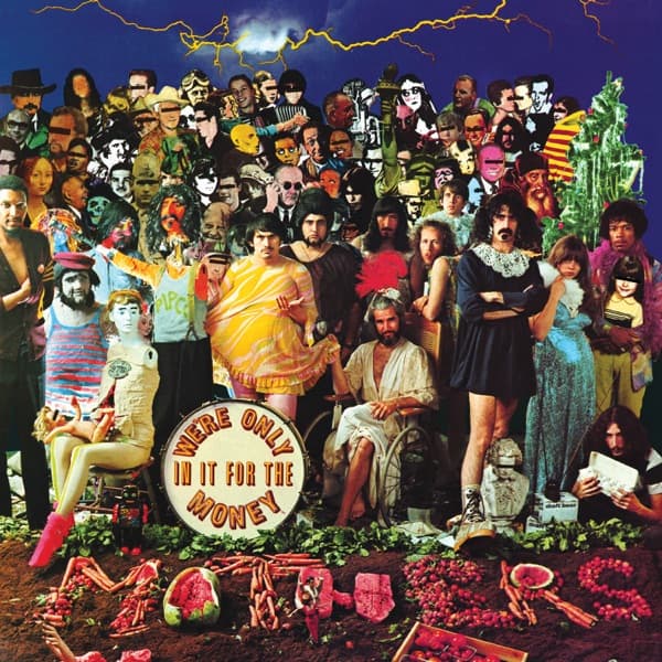
A yellow bolt of lightning cracks across a bruised purple sky, and beneath it a wall of faces stares back at you: masks, portraits, movie monsters, dime-store cutouts jammed shoulder to shoulder like a crowd that will never disperse. This is We're Only in It for the Money, released on March 4, 1968, by Verve Records, and every inch of it is aimed at a single target. Where The Beatles had gathered their heroes under a sunny sky for Sgt. Pepper, The Mothers of Invention assembled a storm.
The idea belonged to Frank Zappa. He described what he wanted as "a direct negative" of the Sgt. Pepper sleeve: they had blue skies, so he ordered a thunderstorm; the Beatles wore satin band uniforms, so his men would wear dresses; the famous foreground of flowers spelling out a name would rot into a spread of vegetables. Art director and designer Cal Schenkel, who had begun working for Zappa the previous spring, took Zappa's sketch and built it into a physical thing, and photographer Jerry Schatzberg shot the assembled tableau. Zappa financed the roughly four thousand dollar session himself.
Look at the center and you can read the whole conceit. A bass drum sits in the dirt, its skin lettered with WE'RE ONLY IN IT FOR THE MONEY, echoing the drum that anchored Sgt. Pepper. The band cluster around it not in uniforms but in gowns and thrift-store finery: one figure lounges in a yellow shift, another stands with arms crossed in a black dress and beaded collar, a robed figure sits as if enthroned in a wheelchair. Schenkel remembered his own dress running about two hundred dollars. Mannequins mingle with the living, and the front edge of the image dissolves into churned soil strewn with carrots, watermelon slices, and produce arranged where Sgt. Pepper had laid its floral tribute.
Behind them rises the crowd, the true parody engine. The dense collage packs in public figures the way Sgt. Pepper packed its own: Lee Harvey Oswald and Lyndon B. Johnson, the writer Franz Kafka, blues singer Big Mama Thornton, horror actor Lon Chaney Jr., the Renaissance face of Leonardo's Ginevra de' Benci, Pope Paul III, the vampiric Count Orlok played by Max Schreck, plus Eric Burdon, Lloyd Price, and Rod Serling. The eye keeps snagging on grotesque masks and skull faces before it finds a familiar one, which is exactly the queasy, funhouse effect the piece trades on.
One figure in the throng was not a cutout at all. Jimi Hendrix, back in America that week to headline the Monterey Pop Festival and hanging around the Village, turned up to the shoot in person and stood among the props as a real body in the crowd of paper ones. It is a small, strange detail that captures the moment: a living guitar hero planted inside a satire of hippie idolatry.
The joke was pointed. This was experimental music and psychedelic rock wielded as satire, aimed at both the hippie movement and the Beatles who had become its soundtrack. But the parody was close enough to the original to make lawyers flinch. In September 1967, in London, Zappa telephoned Paul McCartney to ask permission to send up the Sgt. Pepper sleeve. McCartney told him it was a matter for business managers, and that the sleeve rights belonged to EMI, not to the band. Permission with EMI and Capitol was never cleared.
When the label grasped what it was holding, the release stalled for roughly five months over legal fears. Rather than kill the images, Verve turned the package inside out. The full Sgt. Pepper parody was demoted to interior artwork, while the band-in-dresses shot that had been meant as the inside gatefold gag was promoted to the front sleeve. Zappa was furious at the inversion and blamed McCartney for it. Schenkel simply felt the Sgt. Pepper parody was the stronger image. Later reissues restored Zappa's intended cover, which is how the storm, the crowd, and the dress-clad Mothers came to sit together on the front where he had always wanted them.
The production ran even deeper into Beatles territory than the design did. Schenkel physically produced a cutout collage insert for the record, and it was printed on the same press sheet as reprints of the Sgt. Pepper insert, with technical help from Dick Roth at Queens Litho, who happened to be printing Sgt. Pepper at the same time. The parody was quite literally coming off the same machine as the thing it mocked.
Visually, the sleeve refuses the warmth of its model at every turn. Sgt. Pepper glows; this glows sickly, all acid yellows, fevered greens, and the electric-blue dark of a sky about to break. The composition is deliberately overstuffed and slightly repellent, more circus sideshow than celebration, and the vegetables at the bottom read less as garden than as garbage. Nothing here invites you in the way a pop record is supposed to. That is the point of a negative.
Schenkel and Schatzberg had built the first of what would become countless send-ups of the Sgt. Pepper sleeve, and few of the imitators carried its edge. This one was made by people who phoned the Beatles first, got tangled in EMI's paperwork, and ended up with their masterstroke buried inside the jacket for years. Under the lightning, the crowd is still staring, and the drum still tells you exactly what everyone was in it for.