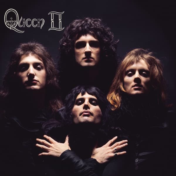
The composition is tightly controlled, and it shows in how little distracts. There is no set, no props, no colour beyond skin, hair and the deep shadow. Every element has been stripped away so the only thing the eye can do is travel from face to face and settle, finally, on the crossed hands at the bottom.
The four figures form a diamond. Three float in the upper row and one anchors the point below, and the geometry gives the whole frame a stability that keeps pulling the gaze downward and inward. The lighting does the theatre for them, carving faces out of nothing: cheekbones, brows and jawlines glow while everything else dissolves into black. It is a portrait engineered for maximum drama on the cheapest possible stage, a black void and four faces.
Each face is lit to its own effect. The fair-haired figure at left reads soft, with heavy-lidded eyes. The mass of dark curls at the top is the sharpest and most severe. The lion's mane of tawny hair at right catches the light in a different register again. And at the point of the diamond, the fourth man tilts his chin up, dark hair framing pale skin, hands folded across his chest.
Mercury's crossed hands and upturned face are the picture's fulcrum. All four glare into the camera with blank, unreadable expressions, and that refusal to perform is exactly what makes the image cold and commanding. The eyes stare back, and nothing about the mouths or the posture offers reassurance.
The borrowed pose changes how the glamour reads. This is not a picture of a young band trying to look tough; it is a picture reaching back to old Hollywood, to a star lit for maximum mystique. The crossed hands, the upturned face, the light pooling on the features against black, all of it lifts the shot out of its year and gives it the prestige of a vintage studio portrait.
The typography sits quietly in the top-left corner. The words 'Queen II' are rendered in an ornate, silvery script with a small crown worked into the design. It is elegant and restrained, deliberately not shouting, so that the lettering never competes with the faces. It reads almost like the title card of a film, which suits a cover that already borrows a film star's pose. The whole sleeve behaves like a single held frame from something cinematic.