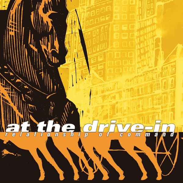
The palette is stripped to three registers: a hot cadmium yellow field, a warmer orange accent, and dense black. That restriction reads immediately as screen-print logic, colour laid down in flat separations rather than blended, and it gives the whole surface the flare of a caution sign or a photocopied flyer bleached under a streetlamp. Yellow this saturated is a signal colour, the hue of hazard tape and warning triangles, and using it as the entire ground turns the cover into something that alarms before it explains. There is no calm here to rest in; the eye is put on alert by colour alone.
The dominant shape in the upper left is the head and neck of a horse, worked as a near-solid black mass with white gouges cutting through it. The technique looks scratched or carved, the way a woodcut or scratchboard leaves bright lines torn out of black, and that roughness matters: the animal is not smoothly rendered but hacked into being, all splinter and gash. Read against the Trojan subject, the horse is the trap, and the violence of the mark-making tells you the gift is not benign. The white slashes across its jaw and cheek could be harness, could be wounds, could be the grain of hollow timber. The ambiguity is the point.
Behind and to the right, the yellow field resolves into a wall of tall buildings, windows stacked in receding grids, a canyon of towers rendered in the same carved black-on-yellow. Placing the mythic horse against a modern skyline collapses antiquity into the present: the wooden horse wheeled into a contemporary city, the ancient stratagem still running in a world of office blocks. Diagonal black streaks rake down across the buildings like scratches on a negative or rain on a window, dragging the eye downward and adding a sense of speed and damage, as if the image itself has been keyed or clawed.
The eye enters at that black horse head, the heaviest mass and the strongest contrast, then is pulled rightward and back into the depth of the buildings, then down the diagonal streaks toward the base. There a row of legs, four or five of them, marches across the bottom in solid orange. They belong to the horses (or the horse, multiplied), striding as a herd, and rendered in the warmer orange they sit forward of the yellow, closer to the viewer, advancing. The legs are the only element with real forward motion, and by putting them at the very bottom edge the composition makes them feel like they are walking off the sleeve toward you.
Type sits in the lower third and is treated as part of the image rather than a label placed on top. "at the drive-in" runs in a heavy, rounded lowercase, black with the word "drive-in" knocked out or shifted so it reads bright against the dark, a tension between the two halves of the name that keeps it from being a flat wordmark. Directly beneath, "relationship of command" is set in a compressed italic that leans forward, its slant echoing the diagonal streaks above and the forward stride of the legs. Everything in the lower zone is pushing right and forward; the momentum is unanimous.
Light and shadow here are not naturalistic but graphic: there is no single light source, only the binary of black shape against luminous ground. That flatness is what makes the image feel like propaganda or a poster, a thing meant to be read at a distance and to hit fast, which suits a title built on the word command. Negative space is scarce; the yellow that might be rest is instead crowded with building detail and scratch marks, so the composition never lets the viewer relax into emptiness. The busyness at the edges and the solid black weight at the top create a claustrophobic pressure, a city and a threat closing in around the small clear band where the name finally lands.
Assembled, the picture argues its own title. A horse of war, carved rough and set loose in a modern city, a herd of legs advancing over the band's name, a whole surface pitched in warning yellow and streaked as if under attack: the disguised aggression of the music given a single readable emblem. The gift at the gate is also the weapon inside it, and the design refuses to soften that. It works because the restraint of three colours and one carved technique keeps a potentially cluttered scene legible, so the metaphor arrives whole in a single glance while the scratched surface rewards a longer, more uneasy look.