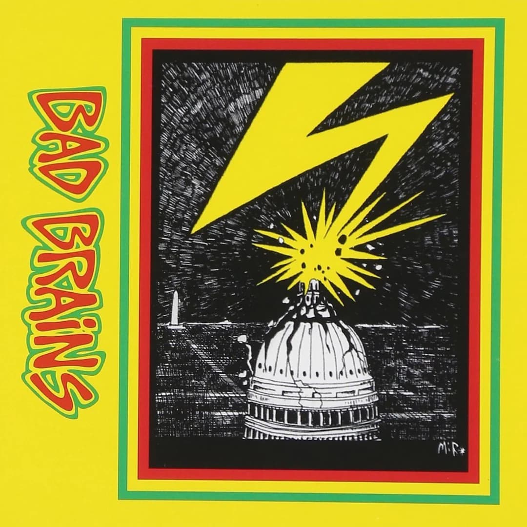
The picture is built on a single vertical event: a yellow lightning bolt drops from the top edge and lands dead center on the pale ribs of a domed building. The bolt does almost all the compositional work. It enters from the upper right in a hard zigzag, then straightens into a thick shaft as it plunges, and the eye follows it down like a dropped plumb line, arriving at a burst of white spikes where the strike meets the dome's crown. That collision point is the true focal node, a small sunburst of radiating lines that reads as impact, discharge, and detonation all at once. Everything else in the frame is arranged to send you back to that point.
Colour is reduced to a tight, aggressive triad. The bolt and its halo are a saturated cadmium yellow, the same yellow that floods the surrounding J-card, so the lightning seems less like a thing inside the picture than like the background itself punching through and striking down. The dome and sky are worked in dense black-and-white hatching, which throws the yellow forward with maximum contrast. The frame is banded in red and green. Set against the yellow field, that red-yellow-green combination is unmistakably the Rasta tricolour, and it quietly signals the reggae half of the music before a note plays, wrapping a very American monument in Rastafarian colours.
The technique is scratchboard or heavy pen crosshatching, and it matters to the meaning. The night sky is not a smooth wash but a storm of tiny gouged white flecks against black, a hand-scratched turbulence that makes the whole atmosphere feel charged and unstable. The dome is rendered in the same nervous line, its curved surface described by contour hatching that never settles into clean architectural drafting. This is deliberately not the calm engraving of a government seal or a tourist postcard; it is the monument redrawn by an agitated hand, and the agitation is the point. The medium's roughness carries the message that the seat of power is being shaken.
Read the subject and the argument becomes plain. The bolt strikes the dome of a capitol building, the most concentrated visual shorthand for state authority, and the strike lands precisely on its highest point, the ceremonial peak. This is power being hit from above, judgment or energy coming down on the house of government. The burst of light at the crown reads two ways at once: destruction, and a kind of crowning charge, as if the building has been lit up rather than merely damaged. That ambiguity keeps the image from being a simple cartoon of demolition and turns it into a charged emblem.
Secondary details reward a closer look. To the left of the dome, low in the black band of ground, a small thin vertical spike rises against the sky, a distant obelisk-like form that anchors the scene as a skyline and keeps the dome from floating in pure abstraction. The horizon sits low, so the storm-sky occupies most of the frame and the building squats near the bottom, small under the weather. That proportion, tiny monument beneath an enormous violent sky, is itself an argument about scale: the institution is dwarfed by the force bearing down on it. In the lower right corner of the illustration the artist's mark, the letters MIR, sits in white, the only handwritten trace of a maker inside an otherwise emblematic image.
Typography operates in two registers. Inside the illustration and along the packaging, the band name appears in a bulging, hand-drawn balloon lettering, rounded and swollen, with the lower BAD BRAINS on the yellow card shaded in the same red-and-green scheme so the letters seem inflated and about to burst. That cartoon swell is playful and confrontational at once, a punk hand-lettering that refuses the tidy geometry of a corporate logo. Against it, the functional type is stark and machine-plain: the STEREO and catalogue markings up top, the track lists set in small caps down the left column under a bold numeral 1 and letter A. The clash of that swollen hand-drawn name with the clinical little track type mirrors the record's own split personality, chaos and system side by side.
The format is honest about itself as a cassette. The tall narrow left strip with its spine text, the STEREO tag, the sequential song titles: this is a J-card, printed cheap and folded, and the flat bright yellow is exactly the colour that survives low-budget printing and jumps off a rack. The image works because it does so much with so little: three colours, one hand-scratched drawing, one downward gesture. The bolt gives it instant kinetic legibility, the tricolour frame smuggles in the reggae identity, and the hatched storm supplies the mood of threat. What the whole says is compact and blunt: energy from outside striking the center of official power, the band's own expulsion and defiance recast as a natural cataclysm aimed straight at the dome.