Visual history · source-backed research
Pixies 4AD Cover Art
Vaughan Oliver, Simon Larbalestier and a visual language that changed on every record
The classic Pixies sleeves were not built from a fixed logo, a band portrait or one repeating layout. They were built from a working relationship: 4AD designer Vaughan Oliver responding to the music and photographer Simon Larbalestier supplying images that could be staged, toned, cropped and recontextualized. Across Surfer Rosa, Doolittle and Bossanova, the materials change while the appetite for ambiguity stays intact.
Quick answer
Who made the Pixies' classic 4AD covers?
Vaughan Oliver art-directed the Pixies' classic 4AD visual identity, while Simon Larbalestier photographed the imagery used across the three covers documented here. Oliver described the process as beginning with the music, lyrics and conversations with Black Francis, then building an atmosphere rather than illustrating a lyric literally.
1988 → 1990
Three covers, three different visual problems
01 · 1988

Staged figure · monochrome / sepia
Surfer Rosa
The band supplied the starting idea; Simon Larbalestier and Vaughan Oliver developed the scene during the shoot. Larbalestier has described the early Pixies cover subjects as friends or friends of friends rather than standard professional models. The distressed set, Catholic details and theatrical pose gave Oliver material that could feel like a found object instead of a band portrait.
Read the complete cover story →02 · 1989
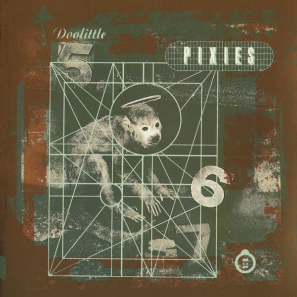
Constructed still life · darkroom intervention
Doolittle
The collaboration moved away from a human figure and into a series of strange photographic objects. Larbalestier described shooting on very fine-grain black-and-white film, then hand-bleaching and toning the final artwork prints. Oliver selected the macaque image for the album and built the typography and diagram-like graphic system around the photographs.
Read the complete cover story →03 · 1990
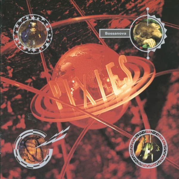
Color photography · same creative partnership
Bossanova
Bossanova marks the clearest material change in the three-cover run: color. Larbalestier later said the move was requested by the band's management rather than something he would have initiated himself. The palette changes, but the larger idea remains — a suggestive image world instead of a straightforward photograph of the Pixies.
Read the complete cover story →
The design side
Oliver designed mood, not a house template
Oliver's descriptions of the Pixies process are remarkably consistent: listen to the record, read the lyrics, talk to the band, then find a visual route that captures the atmosphere. In an Eye interview about the later Minotaur box, he specifically connected the Pixies to dark humor, surrealism and sexuality — but also stressed that the sleeves were not attempts to illustrate those themes literally.
That distinction explains why the records can look so different while still belonging together. The continuity lives in the approach — oblique image, tactile surface, expressive type — rather than in a repeated logo or palette.
The photography side
Larbalestier gave the sleeves physical texture
Larbalestier's own archive emphasizes a traditional photographic practice: film, darkroom printing, toning and visible print borders. His Doolittle recollections are especially useful because they document hand-bleaching and toning rather than a later digital reconstruction of the imagery.
The shift to color on Bossanova also shows the partnership responding to practical pressure. Larbalestier has said management requested the color work and that he preferred the earlier monochrome approach. The change did not break the visual identity; it revealed which parts of that identity were deeper than color.
Attribution
Who did what?
| Creator | Role | Pixies work documented here |
|---|---|---|
| Vaughan Oliver | Art direction & design | Surfer Rosa, Doolittle, Bossanova |
| Simon Larbalestier | Photography | Surfer Rosa, Doolittle, Bossanova |
Frequently asked
Pixies 4AD cover-art questions
- Who designed the Pixies' classic album covers?
- Vaughan Oliver art-directed the classic 4AD identity, working with photographer Simon Larbalestier across Surfer Rosa, Doolittle and Bossanova.
- Who photographed Surfer Rosa and Doolittle?
- Simon Larbalestier made the photographs; Vaughan Oliver handled the art direction and design. Their collaboration extended across the Pixies' original 4AD visual identity.
- Why does Bossanova look different?
- It moved the partnership into color. Larbalestier later said that change was requested by management, which makes Bossanova a useful example of the visual system adapting without becoming a standard band-photo package.
Sources & research notes
What this page is based on
The process claims above are grounded in interviews with Oliver and Larbalestier, Larbalestier's own archive, and design-history reporting. Interpretation is kept separate from attribution: where the creators describe how something was made, we treat that as evidence; where we compare the three sleeves, we label it as visual analysis rather than inventing a hidden intention.
- Vaughan Oliver's Minotaur — Eye Magazine
- 23 Envelope: ambience and inner space — Eye Magazine
- Simon Larbalestier — photographer profile — Simon Larbalestier
- Doolittle cover interview with Simon Larbalestier — Album Cover Hall of Fame
- Life to the Pixies — oral history — SPIN