Pink Album Covers: From Pink Flag to MONTERO and Death Grips' Money Store
Pink might be the most weaponised colour in recent record-cover design. It's been claimed, reclaimed, satirised, and re-coded enough times that any new pink cover is automatically in dialogue with the last decade of pink covers.
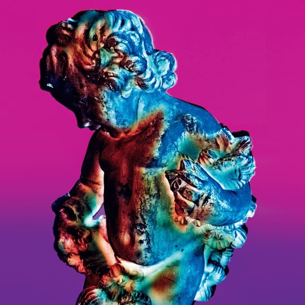
Death Grips' The Money Store turned bubblegum pink into menace by pairing it with a hand-drawn punk subject. Lil Nas X's MONTERO uses pink in a Renaissance composition that knows exactly how much religious imagery it's borrowing. Mac DeMarco's Salad Days, Charli XCX's covers, and a long line of indie records use pink as comfort and irony at the same time.
The covers below span the full range — from earnest pop to deadpan dispatch. Pink is rarely a passive choice on any of them.
For more colour-themed collections, see black album covers, red album covers, blue album covers, and black & white album covers.
12 pink album covers in the archive.


Frequently asked questions
- Why do contemporary album covers use pink so often?
- Pink has become a charged colour in pop culture — it carries gender-coding, religious-coding (especially in 2020s pop covers), and irony all at once. That makes it useful for artists who want a cover to be in conversation with culture rather than just decorative.
- Are any classic albums known for pink covers?
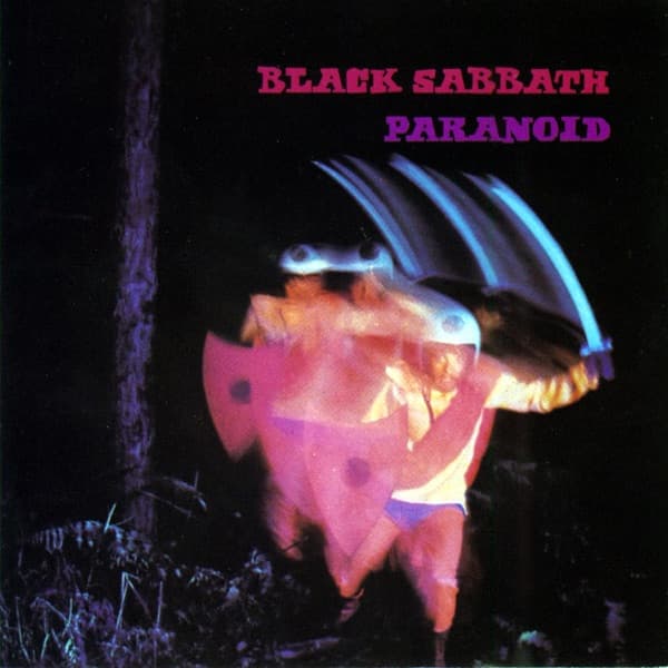
- Wire's 1977 Pink Flag is the canonical post-punk pink cover, and Aerosmith's 1997 Nine Lives uses pink as nostalgia. But the bulk of important pink covers are recent — MONTERO, The Money Store, Charli XCX's catalogue.
- What separates a 'pink' cover from a 'red' one?
- Lightness, mostly. Pink covers tend to have brighter, less saturated reds with a soft-light feel. Our build-time script splits the two based on the dominant swatch's hue and lightness — full-saturation red sits in the red bucket, lighter pinks sit here.