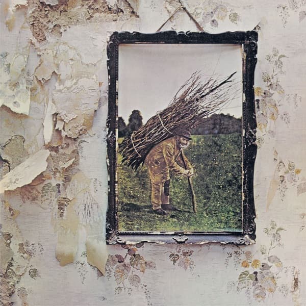
The cover works by subtraction. There is no band name, no title, no printed word of any kind on the front, and that blankness is the composition's loudest gesture. The eye, denied the usual anchors of type and branding, is forced onto the single object hung in the frame and the wreck of a wall around it.
That framing is literal. The picture sits inside a chipped black-and-gilt frame, and the frame in turn floats on a larger surface of peeling, water-stained Victorian wallpaper. The faded floral pattern flakes away in great torn patches to reveal raw plaster beneath, so the entire cover is built on two nested images: a picture within a picture, order within ruin. The eye moves from the ornate edge inward to the human figure, then drifts back out to the decay pressing in from every side.
Inside the frame the reading is quieter and sadder. A bowed man crosses green grass, a heavy bundle of cut sticks roped across his back, one hand on a walking staff. His brown coat, white beard, and folded posture read as pure exhaustion and endurance. The field behind him opens to a hazy line of trees, giving depth and a soft horizon that keeps the scene pastoral rather than claustrophobic. The colours are gentle and slightly unreal, a tinted, dreamlike softness that sits oddly against the harsh, cracked texture of the wallpaper.
The whole meaning lives in that contrast. A tender rural scene, an old man and his labour, is preserved intact inside its frame while the modern domestic house around it rots. The countryside is held safe under glass; the building crumbles. It reads as a small argument about what lasts and what falls away, the eternal weight of manual work set against the transience of walls and paper. The absence of any band identity reinforces the point: the group withdraws entirely, leaving only this anonymous labourer to carry the sleeve, an image about burden and continuity rather than celebrity.
The interior extends the theme into myth. Open the gatefold and a robed figure holds a lantern aloft on a mountaintop, a solitary seeker at altitude. Titled 'The Hermit', the image leans directly on the Hermit card of the Rider-Waite tarot deck, the archetype of the wise recluse guiding others with a raised light. Placed against the front cover's exhausted stick-carrier, the two figures rhyme: both are lone old men, both bent to a task, one climbing toward illumination while the other bends under his load. The sleeve spans, as the music does, a distance as wide as the gulf between a thatcher's bundle of sticks and a lantern on a mountain.
Even the lettering is chosen art. On the inner sleeve the 'Stairway to Heaven' lyrics appear in an ornate hand-built typeface, an Arts and Crafts style drawn out into a full alphabet, its antiquarian curl matching the aged, hand-tinted look of the cover picture. The result is an object that reads as found and old throughout, a deliberate rejection of the sleek modern rock sleeve in favour of something that looks salvaged, weathered, and quietly haunted.