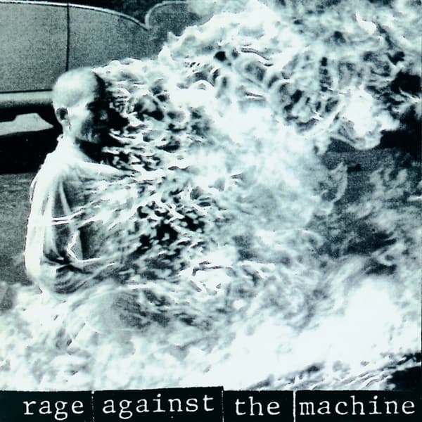
The composition follows the conventions of photojournalism: a medium-wide shot that establishes the scene, places the subject in context, and lets the viewer take in both the central action and the surrounding reaction. The burning monk occupies the center of the frame. The horizontal lines of the street and buildings provide a stable architectural framework, against which the vertical column of flame creates a dramatic axis. This is the structural tension the whole image runs on: a calm grid of the built world violated by a single upward spike of fire.
The focal path is ruthless. The flames pull the eye first, then the composed, seated figure inside them, then outward to the bystanders in the background who add human scale and emotional response. Their presence confirms this is a real event witnessed by real people, not a staged tableau. The eye keeps returning to the still hands in the lap, and it is that stillness, framed by chaos, that makes the picture impossible to look away from.
Colour and tonality do quiet but decisive work. In the original photograph the palette is muted by the Saigon haze and the characteristics of early 1960s colour film, with the flames providing a vivid accent of orange and yellow that draws the eye with irresistible force. The design team reproduced the image in a slightly desaturated palette shifted toward warm ochre, giving it an aged quality that emphasises historical distance while preserving visceral immediacy. The pavement, the robes, and the automobile behind the monk are rendered in soft greys and browns that make the flames appear even more vivid by contrast.
Typography is deliberately restrained. The band's name runs across the bottom in a bold, condensed font, partially obscured by the photograph's lower edge, so the image is never fully cropped to accommodate the text. The treatment is minimal and direct, refusing to elaborate on or aestheticise the picture above it. The font suggests newspaper headlines or political poster typography, reinforcing the documentary origins of the image and the band's self-conception as political actors rather than entertainers.
The argument extends to the reverse. The back cover carries an image of rioting, pushing the claim that political violence is not an aberration but a constant in American and global history. Together, front and back create a visual dialectic between individual sacrifice and collective uprising, between the monk's private spiritual act and the public confrontation the band's music demands.
The ethics are built into the reading. Using a real person's real death as commercial packaging raises questions about exploitation, which the band addressed by framing the image as a document of resistance rather than spectacle. The meaning of the whole, then, is a refusal: refusal to prettify suffering, refusal to separate the music from the cause, refusal to let the viewer stay comfortable.