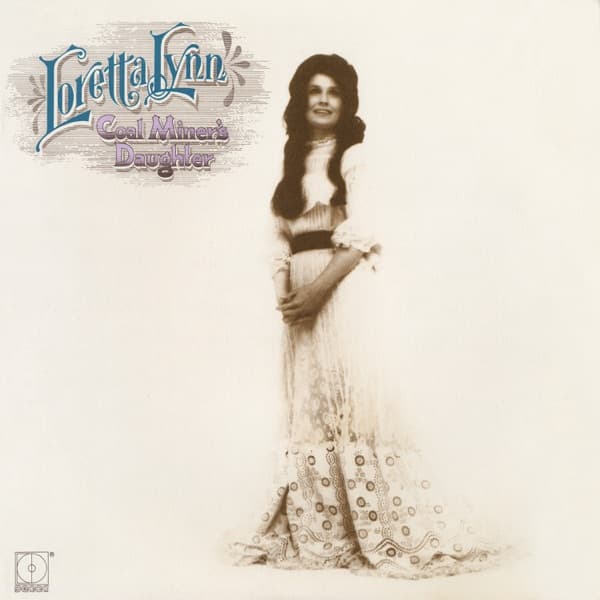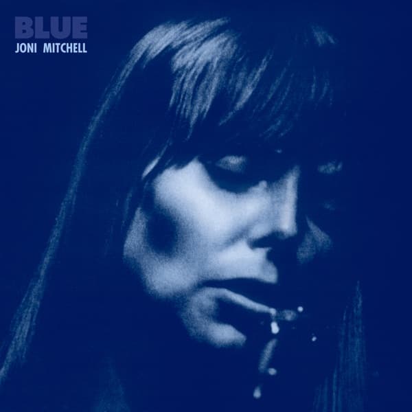
Tim Considine photographed Joni Mitchell for the cover of Blue in a session that produced one of the most emotionally transparent portraits in album art history. The image shows Mitchell with her eyes closed and her head tilted slightly back, her face suffused with an expression that could be read as ecstasy, melancholy, or the particular vulnerability of someone who has stopped performing and allowed their unguarded self to surface. The entire image is bathed in a deep, oceanic blue that gives the album its title and its emotional temperature.
The blue tint was achieved in the darkroom through the manipulation of color channels during the printing process, transforming a conventional portrait into something that exists outside normal photographic reality. The blue is not the blue of sky or ocean but a more electric, almost ultraviolet shade that suggests the interior of a mood rather than the exterior of a landscape. Mitchell's face, rendered in varying tones of blue from near-black shadows to pale, luminous highlights, becomes a topographic map of emotion rather than a document of physical appearance.
The composition is a tight close-up that fills the frame with Mitchell's face and the upper portion of her shoulders. There is no background, no context, no spatial reference; the image is entirely about the face and what it reveals. The tight cropping eliminates distraction and creates an intimacy that borders on intrusion, as though the viewer has leaned in too close during a private moment. Mitchell's closed eyes reinforce this sense of privacy: she is not presenting herself to the camera but retreating inward, and the photograph catches her in the act of withdrawal.
The lighting appears to come from a single soft source positioned in front of and slightly above Mitchell, creating gentle shadows under her cheekbones and jawline that give the face its three-dimensional presence within the monochromatic blue field. The softness of the light eliminates hard edges and sharp contrasts, creating a smooth tonal gradient that moves from the bright center of her face to the darker edges with the slow continuity of a watercolor wash. This soft-focus quality gives the image a dreamlike atmosphere that matches the album's intimate, confessional tone.
The blue palette operates on multiple emotional registers simultaneously. Blue is the color of sadness in English vernacular, and the album's lyrical content, which includes some of the most devastating breakup songs ever written, earns that association. But blue is also the color of depth, of the ocean, of clear sky, of the space between stars, and Mitchell's music on the album achieves a depth of emotional expression that transcends simple sadness. The blue of the cover communicates all of these associations at once, creating a chromatic environment as complex as the music it packages.
Mitchell's face in the photograph is bare of visible makeup, her hair unstyled and apparently wet, creating an impression of rawness and unmediated presence that was unusual for a female artist on a major-label release in 1971. The absence of cosmetic enhancement mirrors the album's musical nakedness: Blue is famously spare in its arrangements, often featuring nothing more than Mitchell's voice and her dulcimer or piano, and the cover reflects this stripped-down aesthetic by presenting the artist with nothing to hide behind.
The typography is rendered in the same blue as the photograph, differentiated only by a slight shift in tone that makes the letters legible against the image. The artist's name and album title are positioned at the top of the sleeve in a clean, modern font that makes no attempt to compete with the portrait. The typographic restraint is absolute: there are no design flourishes, no graphic elements, no borders or frames, nothing but the blue face and the blue words.
Blue's cover has become one of the defining images of the singer-songwriter era and a touchstone for every artist who has attempted to convey emotional vulnerability through album photography. Its influence is not primarily aesthetic but philosophical: it established the principle that the most powerful album portrait is not the most flattering but the most honest, not the most composed but the most exposed. The blue tint that transforms Mitchell's face from photograph to emotional landscape remains one of the most successful uses of color manipulation in album art, a technique that communicates mood more directly than any amount of realistic detail.