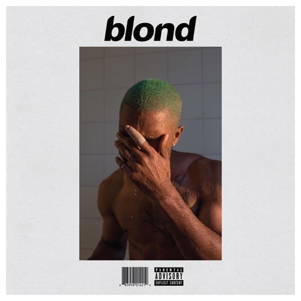
The composition is remarkably simple. Ocean's upper body fills most of the frame, and the single raised hand over his face becomes the picture's central gesture. His features are almost entirely concealed; only fragments read, the line of a jaw, the shadow around an eye. The bandaged finger is the one small wound the eye snags on, a note of vulnerability inside a body otherwise presented as strong and bare. The image is a portrait organized entirely around refusal to be a portrait.
Colour does most of the emotional work. A green tint suffuses the whole frame, as though shot through coloured glass or given a deliberate cast, lending Ocean's skin and the falling water an otherworldly, aquatic quality. Green carries contradictory associations at once: growth and envy, underwater light and hospital fluorescence, nature and artificiality. Here it transforms the ordinary space of a shower into something submerged, as if Ocean were photographed beneath the surface looking up. That aquatic feeling ties directly to the album's recurring interest in fluidity, of sexuality, of identity, of time, and the refusal to be fixed in any single state.
Water supplies texture and movement to what would otherwise be static. Droplets catch the green-tinted light as scattered highlights across skin and arms, a constellation of bright points that give the surface a granular, sparkling quality. The same water softens edges, blurring the boundary between body and space, figure and ground, reinforcing a thematic pull toward dissolution and transformation.
The photograph carries the casual, off-guard quality of Tillmans's best work, a snapshot caught between poses, a private moment made public without being made spectacular. The shower strips away the trappings of celebrity, clothing, styling, context, and the melancholy, intimacy, nostalgia and queerness that recur across Tillmans's pictures are all present in this single quiet frame.
Typography is minimal to the point of near-absence. The title sits in a small lowercase sans-serif; Ocean's name is missing entirely. That restraint is compounded by a deliberate spelling game: the artwork reads blond, while Apple Music and official sources list the album as Blonde, a discrepancy widely read as playing masculine against feminine, a gender-fluid pun folded into a single dropped letter. The choice extends a lineage of extreme graphic restraint, but pushed further than the norm of contemporary R&B and hip-hop packaging, where lavish shoots and bold design are expected. Against that loudness the sleeve is almost aggressively quiet, a whisper in a genre that usually shouts.
Read whole, the image works by inversion. Concealment stands in for display, softness for hardness, ambiguity for clarity. The picture withholds the face precisely because the face is what we came for, and the withholding is the statement.